













🔄 Rearranging blocks on mobile with CSS order without touching HTML
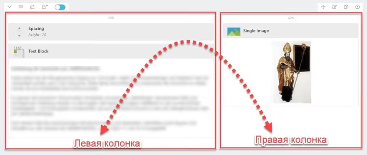
On desktop, columns display correctly: text on the left, image on the right. Open the site on a phone, and the image comes first while the explanation slides down, below the scroll.
Sound familiar? The reason is that on mobile devices the entire layout collapses into a single column, and the block order remains fixed: whichever comes first in HTML appears on top. Nobody wants to change HTML just for mobile: that means duplicating sections or using hacky display: none workarounds.
CSS provides a tool that solves this problem without modifying markup: the order property combined with flexbox. One line in a media query, and the blocks swap places.
💡 Quick overview:
- How flexbox controls block order without changing HTML
- CSS code for swapping two columns on mobile
- How to apply classes through a page builder (using King Composer as an example)
- A ready-to-use snippet: copy it, substitute your classes, test it
How CSS order works: the essentials
Flexbox does more than just align elements horizontally and vertically. Each flex item has a numeric order property that determines its visual position independently of its place in HTML.
By default, all elements have order: 0, so they appear in the order they're written in code. But once you assign order: 1 to one block and order: 2 to another, the browser rearranges them. The lower number always comes first.
The most useful part: order works inside a media query. On desktop, blocks stay in their normal positions, but on screens narrower than 768px, they swap places. Meanwhile, the HTML remains untouched, search engines see the original order, and accessibility isn't affected. MDN confirms: visual order changes, but tab order does not (as long as you don't touch tabindex).
Note that order only works inside a flex container. The parent block must have display: flex or display: inline-flex. Without this, the order property is ignored.
Step-by-step breakdown: applying order in practice
Consider a typical section: two columns in a row on desktop, stacked on mobile. The goal: on phones, the second column (image) should come FIRST, and the first column (text) should come second.
Step 1: prepare the HTML structure
Basic markup consists of a parent container and two child blocks. The order in HTML: text first, then image. This is exactly the structure most page builders generate, including King Composer.
1 <div class="section-wrapper"> 2 <div class="block-text">Текст и пояснение слева</div> 3 <div class="block-image">Картинка справа</div> 4 </div>
Step 2: write the CSS
First, make the container a flex container at all resolutions. Then, in the media query for mobile, assign each block its own order and stretch them to full width.
Add this code in Dashboard → Appearance → Customize → Additional CSS in your theme or through the Code Snippets plugin. Do not edit theme files directly, because your styles will be lost on update.
1 .section-wrapper { 2 display: flex; 3 flex-flow: wrap; 4 } 5 6 @media screen and (max-width: 767px) { 7 .block-image { 8 order: 1; 9 width: 100%; 10 } 11 12 .block-text { 13 order: 2; 14 width: 100%; 15 } 16 }
Breakdown: on desktop, both blocks are regular flex items with order: 0 (the default value according to the specification). Text on the left, image on the right, as in HTML. On screens narrower than 768px, the media query kicks in: .block-image gets order: 1, moving it first; .block-text gets order: 2, placing it second. width: 100% ensures the blocks span the full screen width horizontally.
Key point: the classes .block-text and .block-image are your own naming. In a real project, you'll target whatever classes your page builder or theme generates.
Step 3: how to assign classes in a page builder
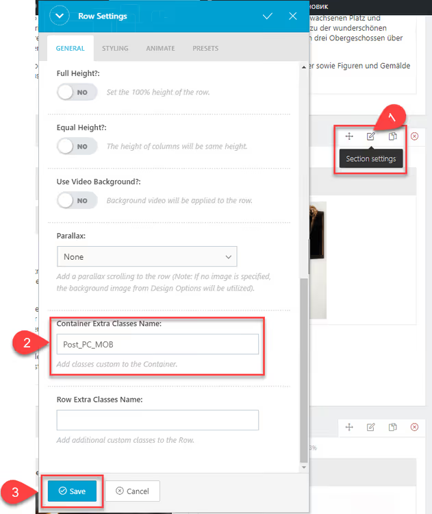
Universal approach: any visual builder (Elementor, Bricks, legacy King Composer, native Gutenberg via group) lets you add a custom CSS class to sections and columns. The screenshots below show the process in the King Composer interface, but the logic is the same everywhere: find the "CSS Class" or "Extra Class" field in the row/column settings and enter the desired name.
A two-column section in King Composer looks like this:
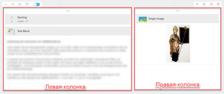
Assign the class section-wrapper to the parent container (the row):
Assign the class block-text to the left column:
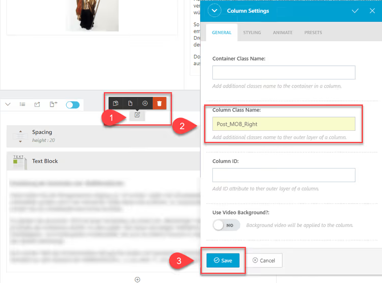
Assign the class block-image to the right column:
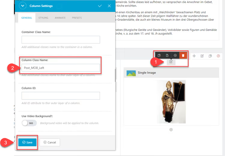
After saving and publishing, check the page on a phone or through browser DevTools (F12 → Toggle Device Toolbar). The blocks should swap places: image on top, text below.
How to adapt this method for your project
Three typical scenarios and what to change in the code:
You're using a different page builder. Find the custom CSS class field in the section/column settings. In Elementor, it's Advanced → CSS Classes; in Bricks, it's Settings → CSS ID & Classes. Enter your class names and update the CSS selectors accordingly.
You're coding by hand without a page builder. Even easier: write the needed classes directly in your template's HTML markup. The CSS code stays the same; just adapt the selectors to your markup.
You have three or more blocks instead of two. Add a rule for each block in the media query with its own order value. For example: .block-a { order: 1; }, .block-b { order: 2; }, and .block-c { order: 3; }. The numbers don't have to be consecutive; you can use order: 10 to guarantee moving an element to the end.
Make sure the parent container has display: flex; without it, order is silently ignored, and you'll waste half an hour debugging. The most common scenario: the container defaults to display: block, flex is applied but overridden by a more specific theme rule. DevTools → Computed will show you the final value.
Watch this short video on the topic, which clearly demonstrates how order rearranges blocks in real time:
⁉️🤔 Frequently asked questions
Does order work in all browsers?
orderhas been supported by all modern browsers since 2015, including Safari on iOS and Chrome on Android. According to caniuse.com data, global flexbox support is 99.2%. If you need IE11 support (it understands flexbox but has bugs), add-ms-flex-orderwith the same value.
Does order break search engine indexing?
No. Search engine crawlers read the page's source HTML, and
orderonly changes the visual order in the browser. Google confirms: CSS rearrangements do not affect ranking. The original content order in HTML remains unchanged.
Why isn't my order working?
Three most common reasons: (1) the parent block isn't
display: flex; (2) the media query is overridden by a more specific theme rule; (3) the child element has a display value other than block (such as inline). It still becomes a flex item, but behavior may differ. Open DevTools, Elements tab → Computed: check whether yourorderis applied and not crossed out.
Can I change order using CSS Grid instead of flexbox?
Yes. Grid has an
orderproperty that works identically. Additionally, Grid offers an alternative: you can setgrid-rowandgrid-columnfor explicit element positioning withoutorder. But if you simply have a row of two columns, flexbox is simpler (less code).
What if my page builder doesn't allow adding a custom class?
Some older or stripped-down builders don't show the CSS Class field. In that case: (1) wrap the section in a group and assign the class to the group; (2) use the builder's built-in CSS selector (for example,
.kc-column-12a3bfor King Composer), which you can find through DevTools; (3) switch to Gutenberg with a group container, where every block has an "Additional CSS Class" field in the right panel.
Key takeaways on swapping block order
The CSS order property is the easiest way to control the visual sequence of blocks without editing HTML. Flexibility is achieved with three lines in a media query: set display: flex on the container, assign order: 1 and order: 2 to child blocks at the mobile breakpoint, and you're done.
The safest implementation path: add CSS through Appearance → Customize → Additional CSS or the Code Snippets plugin; don't touch theme files. Before publishing, test the page through DevTools on an iPhone emulator and on a real device. If order isn't working, first check the Computed display value of the container.
Have you tried this method on your site? Share in the comments which page builder you used and what you swapped.

A professional team of writers and editors specializing in creating quality content.