













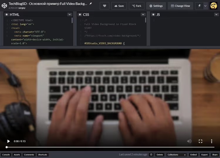
🎬 Adaptive video background with CSS: a complete guide with code examples
You land on a website and the first thing you see is not a static image but a living, breathing video filling the entire screen. It looks expensive. It looks professional. And most importantly, it works on any device, from a phone to an ultrawide monitor, without a single black bar.
You might think something like this requires JavaScript, viewport measurements, and complex math. I thought so too when I first tackled this task. I tried calc(), viewport units, even wrote a resize script. It worked in Firefox, broke in Chrome, and stayed completely silent in Safari.
Then it turned out that CSS has had a property for several years now that does exactly what we need, without a single line of JS. And today I'll show you how to build a fully responsive video background that behaves like background-size: cover, but for live video.
💡 Quick overview:
- Set the video element to fixed positioning covering the entire viewport
- Apply object-fit cover, the video adjusts automatically by cropping the excess and preserving the center
- For older browsers, keep a fallback using media queries and an "oversized container"
- Wrap everything in a container, useful for overlays, buttons, and text on top of the video
- Adapt for mobile: different source, playsinline, and a fallback image
Basic approach: fixed positioning
Any video background starts with making the <video> occupy the entire viewing area. This is done through position: fixed with zero offsets:
1 #myvid { 2 position: fixed; 3 top: 0; 4 right: 0; 5 bottom: 0; 6 left: 0; 7 }
The element stretches exactly to the width and height of the viewport. The problem arises immediately: video is almost always shot in a 16:9 aspect ratio, but the user's screen might be square, ultrawide, or portrait. The result is those black bars that ruin the whole effect.

If you've worked with background images in CSS, you know that background-size has a cover value. It forces the image to fill the container completely, cropping the excess while preserving proportions. We need exactly the same behavior from video. And it exists.
Modern solution: object-fit: cover
The object-fit property was created precisely for this. It determines how a replaced element (image or video) fits into its container, and the cover value works exactly like background-size: cover:
1 #myvid { 2 position: fixed; 3 top: 0; 4 right: 0; 5 bottom: 0; 6 left: 0; 7 width: 100%; 8 height: 100%; 9 object-fit: cover; 10 }
The video scales to completely fill the container. If the proportions don't match, the browser crops the excess from top and bottom (or left and right) and automatically centers the result. No black bars.
As of 2026, object-fit is supported by 96.39% of browsers globally (data from Can I Use). Chrome from version 32, Firefox from 36, Safari from 10, Edge from 79. Internet Explorer 11 doesn't support it, but its market share is approaching zero, and its support period has ended.
For the vast majority of projects, these three lines of CSS are enough. The video background is ready.
Scaling problems: what happens "under the hood"
Even if you use object-fit, it's useful to understand the mechanics. Two scenarios are possible:

First situation: the viewport is wider than the video (screen aspect ratio greater than 16:9). The video stretches in width to fill the entire available area, but its height becomes larger than the screen height, so content gets cropped from top and bottom. The crop area is centered automatically.
Second situation: the viewport is narrower (aspect ratio less than 16:9, for example portrait orientation on a tablet). The video stretches in height to fill the entire available area, the width exceeds the viewport, cropping occurs on the left and right, and the center is preserved.
object-fit: cover handles both scenarios on its own. But if for some reason you're working without it, the next section is for you.
Classic trick with an "oversized container"
Before object-fit became standard, developers used a clever technique. The idea: make the container deliberately larger than both the video and the viewport, and the browser will center the content automatically.
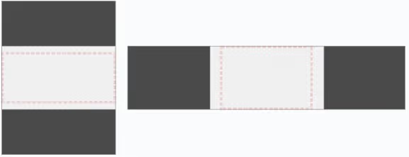
In practice, it looks like this:
1 #myvid { 2 position: fixed; 3 top: 0; 4 left: 0; 5 width: 100%; 6 height: 100%; 7 } 8 9 @media (min-aspect-ratio: 16/9) { 10 #myvid { 11 height: 300%; 12 top: -100%; 13 } 14 } 15 16 @media (max-aspect-ratio: 16/9) { 17 #myvid { 18 width: 300%; 19 left: -100%; 20 } 21 }
Media queries determine which axis has overflow and set a size that's a multiple of the viewport, with a negative offset for centering. The video ends up many times larger than the viewing area, and the browser crops and centers it using the standard mechanism for replaced elements.
Today this code is more of a safety net for legacy projects. But if you're maintaining a site where object-fit is unavailable for some reason, the trick works reliably.
Production code: putting it all together
In a real project, a video background rarely exists by itself. On top of it, there's a heading, a button, a form, an overlay for text readability. That's why the video is wrapped in a container that maintains viewport dimensions:
1 #SDStudio_VIDEO_BACKGROUND { 2 position: fixed; 3 top: 0; 4 right: 0; 5 bottom: 0; 6 left: 0; 7 overflow: hidden; 8 } 9 10 #SDStudio_VIDEO_BACKGROUND > video { 11 position: absolute; 12 top: 0; 13 left: 0; 14 width: 100%; 15 height: 100%; 16 } 17 18 /* Fallback: if object-fit is not supported */ 19 @media (min-aspect-ratio: 16/9) { 20 #SDStudio_VIDEO_BACKGROUND > video { 21 height: 300%; 22 top: -100%; 23 } 24 } 25 26 @media (max-aspect-ratio: 16/9) { 27 #SDStudio_VIDEO_BACKGROUND > video { 28 width: 300%; 29 left: -100%; 30 } 31 } 32 33 /* Override if object-fit is available */ 34 @supports (object-fit: cover) { 35 #SDStudio_VIDEO_BACKGROUND > video { 36 top: 0; 37 left: 0; 38 width: 100%; 39 height: 100%; 40 object-fit: cover; 41 } 42 }
The @supports directive checks for object-fit support and overwrites the fallback rules. A modern browser gets the clean three-line solution. An outdated one works through media queries and the oversized container.
The markup is minimal:
1 <div id="SDStudio_VIDEO_BACKGROUND"> 2 <video autoplay muted loop playsinline> 3 <source type="video/mp4" src="myvid.mp4" 4 media="(orientation: landscape)"> 5 <source type="video/webm" src="myvid.webm" 6 media="(orientation: landscape)"> 7 <source type="video/mp4" src="myvid_square.mp4" 8 media="(orientation: portrait)"> 9 <source type="video/webm" src="myvid_square.webm" 10 media="(orientation: portrait)"> 11 </video> 12 </div>
A few details that are easy to miss. muted is mandatory: browsers block autoplay with sound. playsinline prevents iOS from expanding the video to fullscreen. No need to remind you about loop, a video background without looping looks like an error. Also: provide a square source for portrait orientation via media="(orientation: portrait)". A standard 16:9 clip on a vertical screen will be cropped almost entirely and turn into meaningless flickering.
⁉️🤔 Frequently asked questions
Is it necessary to use <video> specifically, or can I set a YouTube video as a background?
You can use a YouTube iframe as a background, but with caveats. You lose control over buffering, can't remove interface elements, and mobile browsers often block iframe autoplay. For backgrounds, a self-hosted
<video>is always preferable. If you embed YouTube, add the parameters?autoplay=1&mute=1&controls=0&loop=1&playlist=VIDEO_ID.
What video format should I choose for maximum compatibility?
The combination of MP4 (H.264) + WebM (VP8/VP9) covers all modern browsers. MP4 is the primary format, WebM is for Chrome and Firefox (smaller size at the same quality). Resolution for backgrounds: Full HD is enough. Higher resolutions provide quality gains that are imperceptible in a background, while file size grows quadratically. Keep videos within a few megabytes for fast loading.
What should I show users while the video is loading?
Set
posteron the<video>, either a static first frame or a specially prepared image. CSS fallback:background-imageon the container, whichobject-fitwon't cover (it sits on a layer below). For mobile users on slow connections, it's better not to load the video background at all. Use theprefers-reduced-datamedia query and substitute a static image.
How do I make text over the video readable?
Add a semi-transparent overlay between the video and content:
background: rgba(0, 0, 0, 0.4)on a::afterpseudo-element of the container withposition: absolute; inset: 0; z-index: 1. The content itself getsz-index: 2; position: relative. Choose the darkening coefficient based on the specific video: lighter footage needs more, darker footage needs less.
Does this work on iOS and Android?
Yes, with caveats. iOS requires
playsinline(otherwise the video goes into a fullscreen player). On iOS Safari versions before 10,object-fitisn't supported, so the fallback from the production code above will kick in. Android Chrome works correctly. On both platforms, video starts only after the user's first interaction ifmutedisn't set, somutedis strictly required.
What to use in your project: the short verdict
If you're building a website in 2026, use object-fit: cover. Three lines of CSS, no JavaScript, full responsiveness out of the box. Browser support is nearly universal, and coverage only grows each month.
If you have a legacy project with mandatory support for old Edge (before 79) or Firefox (before 36), the production code from the section above gives you both worlds: @supports enables the modern solution, while media queries catch the rest.
And remember: a video background is the icing on the cake. If the clip weighs 20 megabytes and takes eight seconds to load, the user will leave before seeing your beautiful headline. Compress, test at mobile speeds, and always provide a static fallback.
Here's to a great background.

A professional team of writers and editors specializing in creating quality content.