













 AIIllustrative image: AI-generated
💡 16 inspiring pricing table designs: best examples of 2026
A pricing table, not a price list. This is the point where a visitor decides to pay or leave. The design of this point either nudges toward action or buries the conversion.
It's not about flashy buttons. It's about how structure, visual hierarchy, and pricing psychology come together. One technique, and the page works. Another, and the visitor leaves.
Below are 16 examples from Dropbox to BigCartel with analysis: why their tables are memorable and which techniques work.
💡 Quick overview:
- Go through the examples and notice repeating patterns
- Check the comparison table and choose a suitable approach
- Apply the technique matrix from the final section
Comparison table: 16 approaches to pricing table design
Service | Design type | Highlighted plan | Standout feature |
|---|---|---|---|
Dropbox | Card-based, minimalist | No | Package images instead of icons |
Wufoo | Matrix, colorful | Bonafide (green) | Month/year slider + CTA top and bottom |
Freshdesk | Card-based, "green" theme | Yes (animated) | Single GIF element among static content |
Plugmatter | Matrix, branded | Center (brighter) | Same design is a template in their plugin |
Pulse | Minimalist, spacious | Yes (contrasting) | Large button + "Great Value" tag |
Mailchimp | Card-based with slider | Switchable | "Recommended" tag follows the slider |
Zendesk | Card-based, transparent | Yes (orange) | Free trial for ALL plans |
Litmus | Block-based, colorful | No | Two different CTA types (button + savings offer) |
BeanStalk | Card-based, 3D effect | Platinum (raised card) | Different "depth" of cards for different audiences |
Readymag | Two-tone (blue + white) | No | Small dollar sign reduces "price pain" |
Crazyegg | Matrix, trust colors | Blue Plus (blue) | Enlarged font for key variables |
Heroku | Monochrome (purple) | Professional (blue CTA) | Price inside the button, not above it |
Freshbooks | Card-based, "floating" | Evergreen ("most popular" tag) | Number of clients is the only variable |
Slidedeck | Unified, dark | Yes (darker than background) | All plans look identical, decision through features |
YepText | Micro-table, ultra-fast | No | All information in three rows, decision in seconds |
BigCartel | Background-based, image-driven | Yes (image) | Images show "who" the plan is for |
1. Dropbox
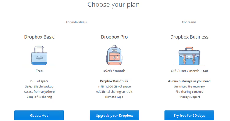
Dropbox plans page, one of the cleanest examples. Three cards, descriptive package images, separation of "personal" and "teams" with a thin line, not color.
Instead of feature icons, contextual illustrations. The team card shows collaboration; the personal one shows organized files. The background blends with the page, so visitors compare plans rather than fight the design.
- Pros: illustrations instead of icons; separation by line, not color; background integration
- Cons: with many features, minimalism may underdeliver information
- Where to look: 🔗 Dropbox Plans
2. Wufoo
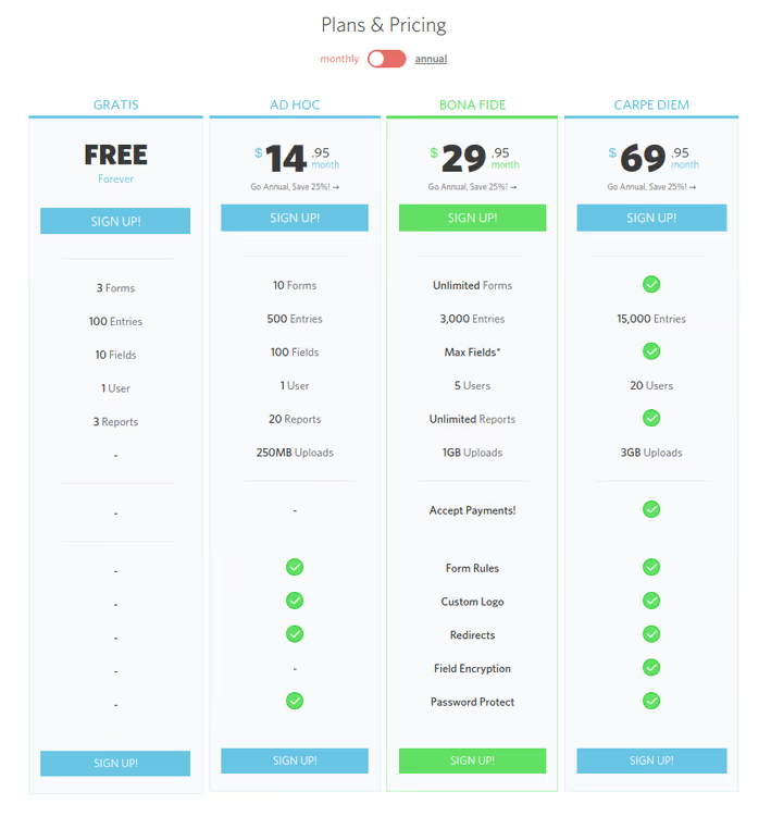
Wufoo uses a full-color matrix with a month/year toggle via slider. Features are shown through comparison: the full list only in the popular Bonafide plan, while left and right show green checkmarks next to available items.
CTA buttons top and bottom. For pages that scroll, this is critical. Scrolled down to study features? The button is already waiting.
- Pros: matrix with slider; feature comparison through popular plan; CTA top and bottom
- Cons: overloaded with color, may look cluttered on mobile
- Where to look: 🔗 Wufoo Pricing
3. Freshdesk
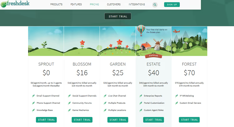
Freshdesk adds an animated element: the popular plan is marked with a floating hot air balloon GIF, the only movement on a static page. Eyes are drawn instantly.
The "growing greenery" theme runs throughout: package images, feature icons, buttons, green shades. Visitors subconsciously associate green with action.
- Pros: animation focuses on popular plan; consistent color theme
- Cons: GIF may distract on repeat visits
- Where to look: 🔗 Freshdesk Pricing
4. Plugmatter
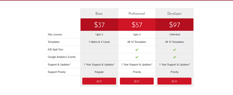
Plugmatter's own example: a matrix in red and white to match the brand. Features on the left, plans on the right, center plan "highlighted" by brightness, not a new color.
The same design is available as a template in their pricing table plugin, a rare case of "eating your own dog food" in action.
- Pros: strict brand style; center highlighted by brightness; design equals product demo
- Cons: high-contrast red is not universal
- Where to look: 🔗 Plugmatter
5. Pulse
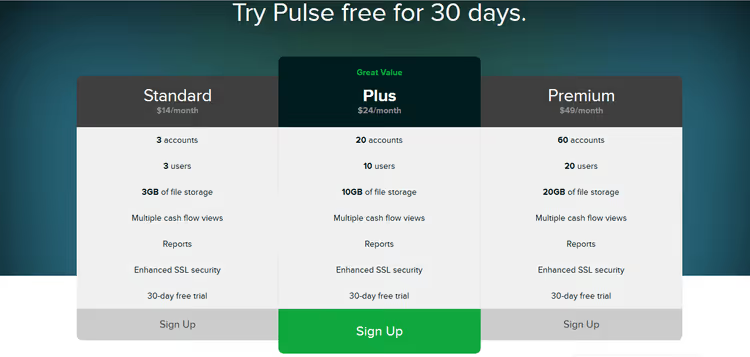
Pulse proves that less text allows bolder design. Spacious layout, large button, minimal descriptions. The popular plan in the center has a darker background and brighter button, with a "Great Value" tag above it.
- Pros: spacious layout gives breathing room; value proposition tag
- Cons: for complex products, there may be too much white space
- Where to look: 🔗 Pulse Pricing
6. Mailchimp
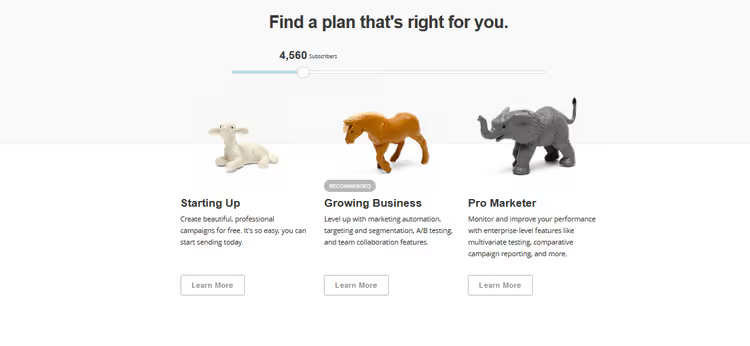
Mailchimp created a dynamic "Recommended" tag: move the subscriber count slider, and the recommended plan changes. Visitors don't have to guess what to pick.
Price is shown after the feature description, so visitors evaluate value before seeing the number.
- Pros: dynamic tag based on needs; price after value
- Cons: on small screens, the slider may be awkward
- Where to look: 🔗 Mailchimp Pricing
7. Zendesk
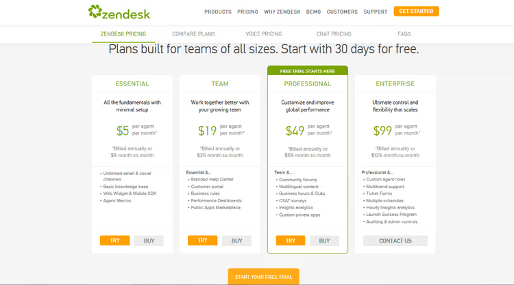
Zendesk offers a free trial for ALL packages, not just the basic one. "Try" buttons are highlighted in orange and lead to a fully functional professional version.
When the trial ends, the downgrade to the basic plan will feel like a loss. Retention psychology through experience, not through discount.
- Pros: trial for all plans; full-featured test period
- Cons: complex product may not reveal itself during trial
- Where to look: 🔗 Zendesk Pricing
8. Litmus
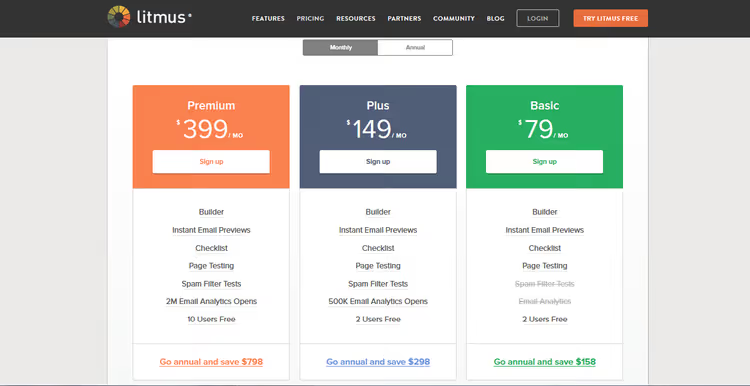
Litmus uses large color blocks, one per plan. The colors complement each other and don't clash.
Two different CTAs: a button at the top, and at the bottom, an offer to save a specific amount on the annual plan. Savings as a number works better than percentages.
- Pros: color blocks to distinguish plans; two semantically different CTAs
- Cons: large blocks require a lot of vertical space
- Where to look: 🔗 Litmus Pricing
9. BeanStalk
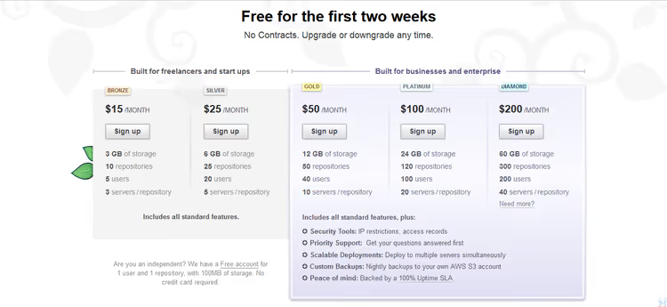
BeanStalk plays with depth: cards for freelancers are flat and gray, while cards for business are three-dimensional and "raised." The visual weight of the card matches the price and audience.
Package names (Bronze, Platinum) don't carry meaning, but detailed descriptions compensate.
- Pros: 3D effect for expensive plans; different "seriousness" for different audiences
- Cons: plan names are uninformative; 3D on an ultra-flat site looks dated
- Where to look: 🔗 BeanStalk Pricing
10. Readymag
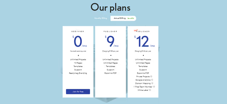
Readymag uses only two colors: dark blue and white. The dollar sign is noticeably smaller than the price number, a technique that reduces "payment pain": visitors focus on the number, not on the fact of spending. Tooltips on features explain options without cluttering the table.
- Pros: minimalism down to two colors; small currency sign technique; tooltips instead of text walls
- Cons: on long tables, two colors may blend together
- Where to look: 🔗 Readymag Pricing
11. Crazyegg
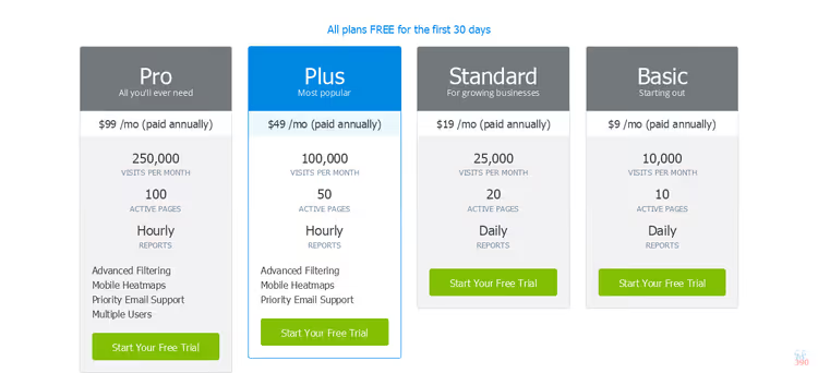
Crazyegg enlarges the variables that differentiate plans, making them much larger than the surrounding text. Visitors don't need to hunt for differences; they jump out immediately.
The selected plan is colored blue (trust), buttons are green (action). Colors work on psychology.
- Pros: exaggerated differences; trust-blue + action-green
- Cons: only for tables with few variables
- Where to look: 🔗 Crazyegg Pricing
12. Heroku
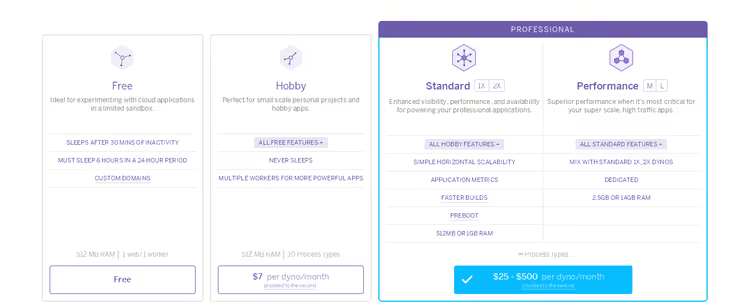
Heroku is almost entirely monochrome: everything in shades of purple, except for a single blue spot on the professional plan button. The eye goes straight there.
The price is built INSIDE the button, not above it. Plan descriptions use inheritance: "All features of the free plan plus…," and so on down the chain.
- Pros: monochrome with one color accent; price inside CTA; cascading inheritance
- Cons: monochrome may seem boring
- Where to look: 🔗 Heroku Pricing
13. Freshbooks
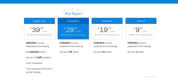
Freshbooks, "floating" text between pages. Most plans differ only in number of clients and price. Fewer differences, cleaner design.
The Evergreen plan has a "most popular" tag and a small dollar sign relative to the number, the same technique as Readymag.
- Pros: cleanliness through few variables; floating effect
- Cons: only when plans differ by 1-2 parameters
- Where to look: 🔗 Freshbooks Pricing
14. Slidedeck
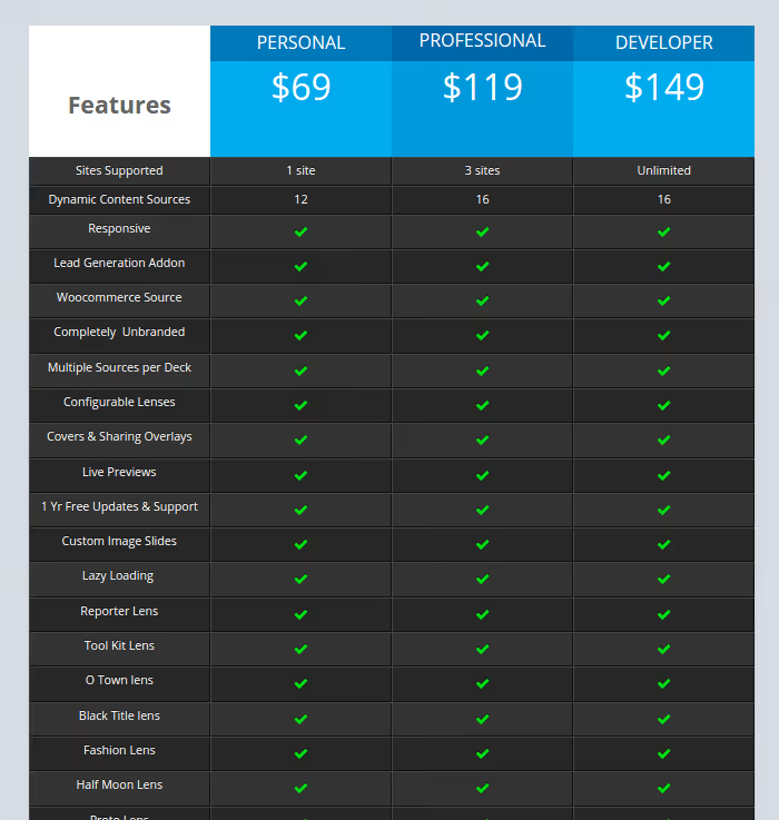
Slidedeck intentionally makes all plans look visually identical; the recommended one is just slightly darker. For an add-on, what matters is not colors but availability of specific features. The design doesn't distract from studying the feature list.
- Pros: design doesn't interfere with comparison; visual equality forces reading
- Cons: without a visual anchor, it's easy to get lost
- Where to look: 🔗 Slidedeck Pricing
15. YepText
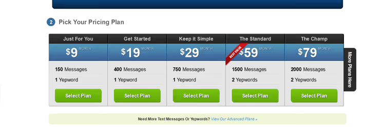
YepText, the fastest table to grasp in the collection. Three rows, distinctive package names (Workin' It, The Beast, The Champ), decision in seconds.
Names reflect the audience, not a formal tier. Emotional connection without a single extra word.
- Pros: ultra-fast comprehension; distinctive names
- Cons: for complex SaaS, too little information
- Where to look: 🔗 YepText Pricing
16. BigCartel
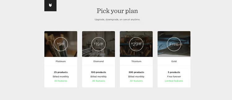
BigCartel uses images as the pricing section background: each picture shows WHO the plan is for, an artist with a couple of works, a growing store, a serious business. A visual portrait of the audience is stronger than words.
Features are revealed in a popup, keeping the table clean while information is one click away.
- Pros: images show the audience; hidden details in popup
- Cons: risk that visitors won't click; not for "face-to-face" comparison
- Where to look: 🔗 BigCartel Signup
Video: pricing table design that increases conversion
Breakdown from DNSK Design Study on how "uglier but clearer" pricing tables increased conversion DNSK Design Study. Six minutes, and it becomes clear why visual "prettiness" often hurts:
⁉️🤔 Frequently asked questions
What makes a pricing table "conversion-friendly"?
Three things: clarity of differences between plans, visual emphasis on the recommended option, and absence of "pain" when looking at the price. Specific techniques: small currency sign, price after value description, one highlighted plan. The DNSK study showed that "clear" tables convert noticeably better than "pretty" ones DNSK Study, 2024.
Is it necessary to highlight one plan as "popular"?
Almost always useful. Visitors arrive with the doubt "which one should I choose?", and the highlighted plan resolves it. The exception is when plans clearly divide by audience, as with Dropbox: personal / team / enterprise. Then it's better to divide visually rather than by highlighting.
How many plans are optimal?
Three or four. Three is the classic: basic / popular / advanced. Four if there's an enterprise segment. Five or more risks "choice paralysis." Of the 16 examples, most use 3-4 plans.
Which colors for CTA buttons work best?
Green ("go") and orange ("act now"). Blue for trust elements. Red with caution: it grabs attention but reads as "danger." The main rule: the CTA button should be the ONLY element of that color on the page.
Should you show the price immediately or hide it behind "contact us"?
For self-service, show it immediately and transparently. Hidden prices irritate. For enterprise with custom pricing, give a hint ("from $X") and provide the exact number through contact. Example: Heroku in the collection.
Which approach to pricing table design should you choose?
16 examples behind us. Now the main thing: what to apply to your project.
If you have 3-4 plans with clear differences, take the Freshbooks or Readymag approach: minimal colors, emphasis on 1-2 variables, small currency sign. Works for most SaaS.
If plans differ significantly by features, use a matrix like Plugmatter or Wufoo: features on the left, plans on the right, checkmarks at intersections. Differences visible in seconds.
If you have clear audience segments, take the Dropbox or BeanStalk approach: different cards for different audiences, visually separated, with distinctive images.
If the product is complex and needs a trial, use the Zendesk model: free full-featured trial for all plans. Let them try the professional version; the downgrade to basic will feel like a loss.
And the main lesson from this collection: pricing table design is not about "pretty." It's about "instantly clear which plan to take." Do that, and the conversion will speak for itself.

A professional team of writers and editors specializing in creating quality content.