














⚡ How to load web fonts without losing speed and accelerate text rendering
When a site takes 3 seconds to load and then spends another second redrawing all the text, visitors leave. Not to competitors, they simply close the tab. The problem is almost always the same: web fonts loaded without considering performance.
According to HTTP Archive data for 2025, about 84% of sites use custom web fonts, and the median site makes 5 requests to font files totaling around 400 KB. On a poor connection, that means 2-3 seconds of render blocking while users see a blank screen. Google also factors Cumulative Layout Shift from font swapping into Core Web Vitals.
The four steps below are not theory. This is the practical minimum that addresses the vast majority of web font performance problems. Each step takes 5 to 15 minutes.
💡 Quick overview:
- Decide on formats: woff2 as the primary and woff as fallback is enough for all modern browsers.
- Add preload for critical fonts so the browser starts downloading immediately instead of waiting for CSS.
- Check your font-face: local(), correct src order, unicode-range for Latin characters.
- Set font-display: swap, and visitors see text instantly even while the font is still loading.
Step 1: Use woff2 and woff, nothing else is needed
There are many web font formats: EOT, TTF, OTF, SVG. But in 2026, you really only need two.
woff2 is the modern standard. Files are 30% smaller than woff at the same quality because they use brotli compression instead of gzip. Browser support includes all evergreen browsers, including mobile Safari and Samsung Internet. Globally, 98%+ of users.
woff is the fallback for a small fraction of older browsers (Safari on iOS 11 and below, rare corporate environments). It is also compressed and works everywhere from IE9+. Keep it last in src, and the browser will take woff2 if it can, otherwise fall back to woff.
Do not use EOT (Internet Explorer 8 and below) or TTF (raw format, no compression) in 2026. The share of such browsers is statistical noise, and every extra format in src increases CSS size and confuses the browser.
If you have files in TTF or OTF, convert them using an online generator. Transfonter produces woff2 and woff in one operation, showing a glyph preview and final file size. An alternative is Font Squirrel Webfont Generator.
Step 2: Preload critical fonts
The browser learns about fonts from CSS, and it reads CSS after HTML. By the time it gets there, 500-800 ms have passed on an average connection. Preload cuts this delay to zero: the browser starts downloading the font as soon as it encounters the tag in <head>, without waiting for CSS.
Minimal working tag:
1 <link rel="preload" as="font" 2 href="/fonts/open-sans.woff2" 3 type="font/woff2" 4 crossorigin="anonymous">
The key is crossorigin="anonymous". Without it, the browser ignores the preloaded font and downloads it again. The reason is that fonts are fetched anonymously (CORS), but preload without crossorigin makes a regular request. The browser considers these different resources and does not match them.
What to preload. Not every font on the site. Only the one used for main text above the fold (above the fold): heading, body, navigation. The rest can wait. Preloading 4-5 files gives diminishing returns and takes bandwidth from critical content.
Important note about Google Fonts and CDN. If you use fonts from Google Fonts, files are periodically updated, and a preload link to an old version will cause double downloading (old + new). Instead of preload for CDN fonts, use <link rel="preconnect"> to the font domain. This speeds up the handshake without risking version mismatch:
1 <link rel="preconnect" href="https://fonts.gstatic.com" crossorigin>
Prefetch for secondary fonts. rel="prefetch" tells the browser: "this resource will be needed later, load it when the main content is ready." Suitable for fonts on internal pages or icon fonts in the footer. Priority is low, does not take bandwidth.
A modern guide to resource prioritization is available in the web.dev documentation.
Step 3: Write @font-face correctly
At first glance, @font-face is simple. In practice, it has four subtle areas, each affecting speed.
Example of a correct declaration:
1 @font-face { 2 font-family: 'Open Sans'; 3 font-weight: 400; 4 font-style: normal; 5 font-display: swap; 6 unicode-range: U+0000-00FF, U+0131, U+0152-0153, U+02BB-02BC, 7 U+02C6, U+02DA, U+02DC, U+2000-206F, U+2074, 8 U+20AC, U+2122, U+2191, U+2193, U+2212, U+2215, 9 U+FEFF, U+FFFD; 10 src: local('Open Sans'), 11 url('/fonts/open-sans.woff2') format('woff2'), 12 url('/fonts/open-sans.woff') format('woff'); 13 }
Breakdown by point:
local(): first in src. If the user already has the font installed on their system (Roboto on Android, Segoe UI on Windows, San Francisco on macOS), the browser takes the local copy and downloads zero bytes. Always put local() as the first line in src. Take the name from the font file itself: local('Open Sans') and local('Roboto Regular').
Format order. The browser goes through src from left to right and takes the first format it understands. Therefore: local() → woff2 → woff. No EOT/TTF/SVG at the end, unless you have a specific audience with old browsers, and then they go AFTER woff (not before).
unicode-range: load only the glyphs you need. For Latin characters, the range U+0000-00FF (Basic Latin + Latin-1 Supplement) is enough. That is about 250 glyphs versus several thousand in the full set. Actual file size drops 3-5 times. Do not overload the range: every extra unicode block adds glyphs that no one will see. For Cyrillic sites, add U+0400-04FF.
Order of @font-face blocks. If you have multiple weights (regular, bold, italic), put the regular weight (font-weight: 400) first. The browser will start downloading that one.
Step 4: Enable font-display: swap and say goodbye to FOIT
Flash of Invisible Text (FOIT) is when the browser hides text for 3 seconds while waiting for the font. Users see a blank page. Flash of Unstyled Text (FOUT) is when text is immediately visible in a system font, then replaced with the custom one. The second is always better than the first.
font-display: swap in @font-face does exactly this: text renders instantly in a system font, and when the custom font loads, it gets swapped in. Ideal for body text.
Other values and when to use them:
swap: for body text. Text is visible immediately, replacement is smooth.optional: for decorative fonts and icons. The browser decides whether to download the font at all. On a poor connection, it will refuse and keep the system font. Wait period is 100 ms.block: short blocking (usually 3 seconds), then text is visible, font will be swapped when loaded. Rarely used.fallback: a compromise. Short blocking, then text is visible, font will be swapped if it loads quickly.
In practice, use swap for body text and optional for icon fonts and decoration. That is enough.
Browser behavior without font-display. If you specify nothing, Chrome hides text for up to 3 seconds, Firefox for up to 3 seconds, Safari indefinitely, and Edge shows the system font immediately. With font-display: swap, this behavior becomes unified and the result is predictable.
How to verify the result
Check your site before and after at web.dev/measure. Lighthouse will show "Ensure text remains visible during webfont load" as a separate line. If the audit is red, your font-display is not working or is missing.
For manual verification: open DevTools → Network, set throttling to "Slow 3G" and refresh the page. Text should appear in a system font instantly, not after 3 seconds of blank screen.
The screenshots below show the difference between the standard approach and the optimized one (test on Slow 3G):
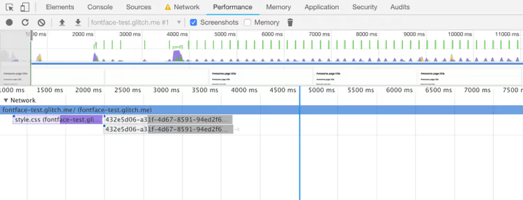
Default: text is hidden until the font loads
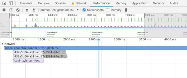
Optimized behavior: text is visible immediately in a system font
The difference is visible to the naked eye: the first screenshot shows a white screen, the second shows content available instantly.
At performance.now() 2024 conference, Mandy Michael covers advanced strategies: incremental unicode-range, font slicing, and working with variable fonts. For those who want to go beyond the four basic steps.
⁉️🤔 Frequently asked questions
Why do I need woff if woff2 is supported everywhere?
Remaining users of old iOS Safari (iOS 11 and below) and rare corporate environments with locked-down browsers do not support woff2. Without a woff fallback, these users will see a system font instead of yours. Woff adds 15-20 KB to the set: a negligible price for covering the remaining share.
Can I just use Google Fonts and not worry?
Yes, and for most sites this is the optimal path. Google Fonts automatically serves woff2 to modern browsers, uses a geo-distributed CDN, and supports
display=swapas a URL parameter. Downsides: dependency on an external CDN (privacy considerations, GDPR), inability to controlunicode-rangeand local font installation. If privacy and control matter, self-host your fonts.
How do I know if fonts are actually slowing down my site?
Lighthouse (the Audits tab in Chrome DevTools) will show the audit "Ensure text remains visible during webfont load." WebPageTest provides a waterfall with timing for each font request. If fonts start later than the first CSS, preload is not configured. If layout shift is greater than 0.1, the font is causing Cumulative Layout Shift, and Google counts this in Core Web Vitals.
font-display: swap ruins the design, text "jumps" on swap?
Yes, this is a known downside of swap. Fight it with two techniques. First: set
font-sizeandline-heightfor text to match the system fallback font. The difference in metrics will be minimal. Second: use Font Style Matcher or thesize-adjustproperty in@font-face(available in modern browsers) to match the custom font metrics to the system font. After adjustment, CLS will be zero.
Should I preload all fonts on the site?
No. Preload only critical fonts: those that form text above the fold (the first 1-2 screens). Load the rest normally through CSS. Preloading 5+ fonts clogs bandwidth and delays more important resources in the queue. In practice, 1-2 preload links cover the vast majority of scenarios.
Is it worth the effort: four steps, four minutes
Setting up web fonts is not a week-long project. Converting to woff2, fixing @font-face, preload, and font-display: swap takes 20-30 minutes of work, even if you have never done it before.
The benefit is measurable: text becomes visible 1.5-2.5 seconds earlier on Slow 3G. Core Web Vitals do not penalize for layout shift. And users do not leave while staring at a white screen.
Start with one font: the main body text font. Do the four steps. Check Lighthouse before and after. The difference in numbers will be more convincing than any argument.

A professional team of writers and editors specializing in creating quality content.