













📱 JavaScript: how to detect screen width, the @media query equivalent in code
Sometimes the layout is already done, CSS media queries are in place, but you need to detect behavior at a specific breakpoint directly in JavaScript. Showing a popup only on mobile devices, rearranging a grid on resize, triggering an animation when the screen is "narrow": all of this requires the script to understand the current window width.
The problem is that developers often take the hard route: they parse window.innerWidth, add throttle to resize, compare against magic numbers, and end up with fragile code that lives separately from CSS breakpoints. Yet browsers have long had a method that works with the same media expressions as CSS.
Below are three practical approaches: from the modern matchMedia (works like @media in CSS) to a jQuery variant for legacy projects. With live examples you can copy and run right now.
💡 Quick overview:
matchMedia: a native method that accepts a CSS media expression and reports whether it currently matches; ideal for syncing JS logic with CSS breakpointsresize+matchMedia: a combination that responds to browser window changes; the script learns about crossing a breakpoint instantly, without periodically pollinginnerWidth- jQuery variant: for projects where jQuery is already on the page; the same
resize, but without nativematchMedia; comparison is done via$(window).width()
matchMedia: the single source of truth for screen width
The main drawback of window.innerWidth is that it knows nothing about your CSS breakpoints. You set 768px in media queries, then write if (window.innerWidth < 768) in JS, and eventually rounding or the scrollbar breaks synchronization.
window.matchMedia() solves this problem radically: it accepts the same media expression string as the CSS @media rule. The result is a MediaQueryList object with a .matches property (true / false). No magic numbers, no mismatch with the layout.
Basic syntax:
1 const mq = window.matchMedia("(min-width: 768px)"); 2 3 if (mq.matches) { 4 console.log("Tablet or wider — 768px+"); 5 } else { 6 console.log("Mobile resolution — less than 768px"); 7 }
The same matchMedia("(min-width: 768px)") call is evaluated by the browser using the same rules as @media (min-width: 768px) in CSS. If the sidebar is hidden at this breakpoint in CSS, JS "sees" the same thing and can, for example, hide the mobile menu.
Besides .matches, the MediaQueryList object provides a .media property (the original query string) and an addEventListener method for subscribing to changes. This means that once you declare a breakpoint in a config, you can use it in both CSS and JS without duplicating magic numbers: just extract 768 into a constant and insert it in both places.
Responding to resize without throttle and workarounds
Checking "right now" is only half the battle. The real magic begins when the script learns about crossing a breakpoint at the moment the window changes.
MediaQueryList has a change event that fires exactly when the .matches value toggles. Not on every pixel of resize, but only when crossing the boundary:
1 const mq = window.matchMedia("(min-width: 500px)"); 2 3 mq.addEventListener("change", function (e) { 4 if (e.matches) { 5 console.log("Screen expanded to 500px or more"); 6 } else { 7 console.log("Screen narrowed to less than 500px"); 8 } 9 });
For backward compatibility with older browsers, you can achieve the same result through a general resize handler on window:
1 window.addEventListener("resize", function () { 2 if (window.matchMedia("(min-width: 500px)").matches) { 3 console.log("Screen width — at least 500px"); 4 } else { 5 console.log("Less than 500px"); 6 } 7 });
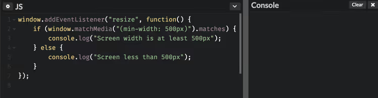
The difference is simple: change on MediaQueryList is an event-driven approach (no extra calls during resize within a range), while resize on window is a fallback familiar to any developer.
Width range: between two breakpoints
A common task is "from 769px to 1024px." matchMedia works like CSS here too: combine min-width and max-width in a single expression:
1 window.addEventListener("resize", function () { 2 if ( 3 window.matchMedia("(min-width: 769px)").matches && 4 window.matchMedia("(max-width: 1024px)").matches 5 ) { 6 console.log("Tablet range: 769px – 1024px"); 7 } else { 8 console.log("Outside the tablet range"); 9 } 10 });
Or as a single expression (browsers understand compound media queries just like in CSS):
1 const tablet = window.matchMedia("(min-width: 769px) and (max-width: 1024px)"); 2 3 tablet.addEventListener("change", function (e) { 4 console.log(e.matches ? "Entered tablet range" : "Left tablet range"); 5 });
Which variant to choose? change on MediaQueryList when you need to catch the exact moment of crossing the boundary (for example, to restructure the DOM tree). resize + matchMedia when the logic is simpler and you just need to "check now" without subscribing to future transitions.
jQuery variant: when matchMedia is unavailable
If the project uses jQuery and polyfills are not an option, the same result is achieved by comparing $(window).width() with a threshold value:
1 jQuery(document).ready(function ($) { 2 if ($(window).width() > 1000) { 3 console.log("Screen width greater than 1000px"); 4 } else { 5 console.log("Screen width 1000px or less"); 6 } 7 });
This code runs once on page load. To track resize, wrap the check in a handler:
1 jQuery(document).ready(function ($) { 2 function checkWidth() { 3 if ($(window).width() > 1000) { 4 console.log("Width > 1000px"); 5 } else { 6 console.log("Width ≤ 1000px"); 7 } 8 } 9 10 checkWidth(); // initial run 11 $(window).on("resize", checkWidth); 12 });
But remember: $(window).width() and matchMedia can differ by a few pixels due to the scrollbar. matchMedia works with the viewport, just like CSS rules. That is why I recommend the native method for all new code.
matchMedia vs innerWidth: a brief comparison
Criterion |
|
|
|---|---|---|
Synchronization with CSS | Full (same expressions) | Manual number adjustment |
Event on breakpoint crossing |
| Only |
Scrollbar handling | Same as CSS (viewport) | Browser-dependent |
Dark theme / | Yes (any media expression) | No |
⁉️🤔 Frequently asked questions
Which is better: matchMedia or window.innerWidth?
matchMediais always better when the logic is tied to CSS breakpoints. It uses the same rules as@media, eliminating discrepancies of a pixel or two due to the scrollbar or zoom.innerWidthis only appropriate when you need the exact numeric value (for example, to calculate how many elements fit), not the fact "screen wider than N pixels."
Does matchMedia work in older browsers?
Yes, support is broad: all modern browsers including mobile, and Internet Explorer 10+. IE9 and below are left behind; for them you will have to use
window.innerWidthor the jQuery variant from this article. In practice, the share of IE9 in 2026 approaches zero.
Can matchMedia check more than just width?
Yes, the method accepts any valid CSS media expression. For example:
(orientation: portrait)for device orientation;(prefers-color-scheme: dark)for dark theme in the OS;(prefers-reduced-motion: reduce)for a request to disable animations. It works just like in CSS:window.matchMedia("(prefers-color-scheme: dark)").matchesreturnstrueif the user has dark theme enabled.
Do I need to remove the change handler when leaving the page?
In modern code, no. The browser clears memory automatically on page unload. In SPAs (React, Vue), where a component mounts and unmounts without a page reload, you must save a reference to the handler and remove it via
removeEventListenerincomponentWillUnmount/onUnmounted; otherwise you will get memory leaks and repeated triggers on "dead" components.
Why do $(window).width() and matchMedia sometimes show different widths?
Because they measure different things.
matchMediaworks with the viewport width (the CSS viewing area), the same one that media queries use.$(window).width()/window.innerWidthincludes the width of the vertical scrollbar, if present. The difference is usually 15-17 px, exactly the scrollbar width. Hence the rule: if you are tying logic to CSS breakpoints, usematchMedia; if you need the "true" window width in pixels, useinnerWidth.
So what to use: the final takeaway
For new code the answer is clear: window.matchMedia(). It lives in the same contract as your CSS, requires no manual number adjustment for each breakpoint, and provides an event model of "it switched, you know" instead of constant width polling.
A typical scenario where the difference is immediately noticeable: you are building a product card that shows a gallery of four images on desktop, but a swipeable single image on mobile. In CSS you have @media (max-width: 768px) changing the layout. In JS, instead of if (window.innerWidth <= 768) you write matchMedia("(max-width: 768px)"), and the browser guarantees that the JS condition will fire exactly when the layout changes. No "almost worked," no bugs at 767px because of the scrollbar.
Leave the jQuery approach with $(window).width() for maintaining old projects: it works, but forces you to duplicate breakpoints in code and silently diverges from CSS by the scrollbar width.
And if you want to see everything described above in action, here is a 10-minute tutorial where matchMedia is explained from invocation to event model:
Try replacing the nearest if (innerWidth < 768) with matchMedia("(min-width: 768px)"), and you will immediately feel how much cleaner the code becomes.

A professional team of writers and editors specializing in creating quality content.