














🚪 10 reasons why visitors leave your website in 2026
You visit a website, and it loads for five seconds. Then, a full-screen popup, the close button is impossible to click, the text is unreadable on mobile. Sound familiar? Your visitors experience this every day. And they leave.
The bounce rate creeps up, conversion drops, and you lose people who could have become customers. It's not that the content is bad. It's that they never get to it.
Below are ten reasons why visitors leave a website. Almost all can be fixed in a day or two without a budget.
💡 Quick overview:
- Check loading speed: anything longer than 2 seconds is already losing visitors
- Remove intrusive popups or configure triggers sensibly: on scroll, with delay, with easy closing
- Test the mobile version with your finger, not a mouse: buttons, fonts, horizontal scroll
- Disable audio and video autoplay, the number one reason for instant tab closing
- Install an SSL certificate if you're still on HTTP: browsers mark such sites as unsafe
1. The site loads slower than visitors are willing to wait
Two seconds is the psychological threshold. According to Google, if a page loads longer, the probability of bounce increases by 32% with each additional second source. On mobile devices, the picture is harsher: at 10 seconds of loading, the bounce rate jumps 123% relative to one second.
The average loading speed of a page from Google's top results is 1.65 seconds. The average website loads in 3.21 seconds, and that's already a failure. The difference between first and average is in image optimization, caching, CDN and clean code.
For WordPress there are plenty of tools: caching plugins (WP Rocket, LiteSpeed Cache), image compression (ShortPixel, Imagify), CDN through Cloudflare. A full breakdown is in our WordPress speed optimization guide.
2. Popups attack before the visitor reads the headline
Popups work. But only when they appear at the right time, not covering content half a second after entry. The visitor hasn't yet understood where they landed and whether there's what they were looking for, and they're already being shoved a subscription form.
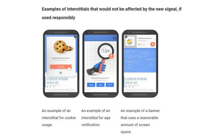
A few rules for popups that don't annoy:
- Show after the visitor has spent at least half a minute on the page or scrolled more than half the text
- Close button is large, obvious, not camouflaged against the background
- Don't show the popup again to those who already closed it
- For mobile, a separate design that doesn't cover the entire screen
Exit-intent popups trigger only when the cursor moves beyond the window boundaries, they at least don't interfere with reading. Google doesn't like them either: large sticky banners covering content on mobile can lower search rankings source. More about safe popup usage in our article.
3. Mobile version exists, but it's impossible to use
According to Statcounter, as of mid-2025, approximately 62-64% of all web traffic comes from mobile devices source. And Google has been using mobile-first indexing since 2016: the mobile version of a page is used for ranking source.
What to check in the mobile version:
- Text is readable without pinching and horizontal scrolling (font size from 16px)
- Buttons and links are spaced at least 8mm apart so fingers don't miss
- CTA buttons are visible without scrolling or after minimal scrolling
- Forms don't require filling 15 fields on a five-inch screen
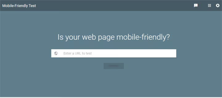
Check your site through Google Mobile-Friendly Test, it takes 30 seconds. Red result, start with a responsive theme.
4. Audio and video autoplay on load
Few things make you close a tab faster than a video suddenly blaring. In an open-space office, cafe, or at home at night, it's an instant bounce. Ten tabs are open, and it's unclear which one has the sound.

Chrome has been blocking audio autoplay by default since 2018 source. But background videos without sound that start automatically and consume mobile data are almost as bad.
If you need video on a landing page: no sound, with muted attribute, with a visible sound-on button. And never hide the pause.
5. Beautiful design, but it's unclear what to click
A site can look like a design studio portfolio: parallax, animations, non-standard grid. But if the visitor doesn't understand in a second where the menu is and how to perform the target action, they leave.

Basic usability rules that work:
- Menu is where the visitor expects to see it: top of the page or left panel (hamburger only on mobile)
- Logo is clickable and leads to the homepage
- Buttons look like buttons: volume, contrasting color, pointer cursor on hover
- Site search if there's more than a couple dozen pages of content
- Consistent style: fonts, colors, spacing don't jump from page to page
The main enemy is advertising that masquerades as a close button (cross), and when clicked opens a landing page. This doesn't just annoy, it destroys trust.
6. Images are boring, stock, and the same everywhere
Images are the first thing the eye picks up on a page. If it's a standard stock photo of "person in glasses looking at a graph" that's on a thousand other sites, there's zero uniqueness, zero trust.
What works instead of stock:
- Product or interface screenshots, specific, with captions
- Your own photos of the team, office, process
- Custom infographics with data from the article
- Diagrams and charts drawn for the material

We've compiled a collection of 35 sites with free photos where you can find images that haven't spread across the entire internet yet. Paid stocks (Shutterstock, Adobe Stock) give access to content with less "exposure" if the budget allows.
7. Content doesn't answer the question the visitor came with
Someone typed "how to speed up WordPress" into search and landed on a page where the first four paragraphs are the history of the web and hosting advertising. No answer. This is the most common cause of bounces after slow loading.

What works:
- First paragraph answers the query the visitor came with, without fluff and preambles
- H1 heading and meta title honestly reflect the content: clickbait gives traffic but kills behavioral metrics
- Key information isn't hidden behind ten paragraphs of warm-up
A separate pain point is pages that ask to disable ad blockers. Yes, content costs money. But the visitor will find the same thing at a competitor who doesn't put a block on entry.
8. Navigation is confusing or nonexistent
The visitor read an article, wants to look at other materials on the topic, but it's unclear where to click. The menu is hidden in a hamburger on desktop, there are no breadcrumbs, links to related posts aren't highlighted.

Minimum navigation set:
- Main menu with logical sections, setting up menu in WordPress takes 10 minutes
- Breadcrumbs: help understand where you are and give search engines structure
- "Related posts" block at the end of the article
- Site search, especially if there's more than 30-40 pages of content
And the most obvious thing that's often missed: all links, both internal and external, should be working. Broken links break user experience and cut crawl budget. How to find and fix them is in our guide to fixing broken links.
9. Site without HTTPS, browsers already stamp it "unsafe"
Chrome, Firefox and Safari have been marking HTTP pages as "Not secure" in the address bar since 2017-2018. According to W3Techs for 2025-2026, about 90% of all sites have already switched to HTTPS, and the share of unprotected sites continues to shrink source.
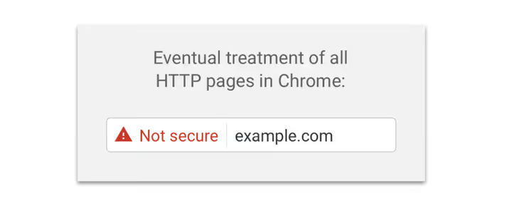
If your site is still on HTTP:
- Browser warning scares visitors even before the page loads
- Google has been lowering HTTP sites in search results since 2014, it's a confirmed ranking signal
- Data input forms (login, subscription, payment) without encryption is user data leakage
With Let's Encrypt, SSL certificate installation is free and automated. Most WordPress hosts have one-click installation. More details in the free SSL installation instructions.
10. The most important thing is hidden below the fold
The first thing a visitor sees when entering a site is the area above the fold (above the fold). If there's no answer to the question "where did I land and what to do here," they leave without scrolling.

What should be above the fold:
- Name and slogan from which the site's topic is clear in 2 seconds
- Navigation menu on desktop, visible, not hamburger
- Key CTA or content entry, not hidden behind a carousel of five slides
Hamburger menu on desktop is a controversial decision. Most users are used to it on mobile, but on large screens it hides navigation and reduces discoverability. Exception is landing pages with one target action.
Run a five-second test: show a colleague the homepage for 5 seconds and ask what the site is about and what to do next. Answer is vague, rework the above-the-fold area.
Good news: unlike SEO, where results come in months, UX fixes work immediately. Sped up the site, bounces dropped the same day. Removed auto-sound, depth of view increased by evening.
The video below breaks down bounce rate in detail with specific cases and proven ways to reduce bounces:
⁉️🤔 Frequently asked questions
What is bounce rate and what's considered normal?
Bounce rate is the percentage of visitors who entered a page and left without interaction: didn't click, didn't scroll, didn't go to another page. The norm depends on site type: for content projects and blogs 60-80%, for online stores 20-45%, for landing pages 30-55% source. If a blog shows close to 90%, and a store over 70%, it's time to sound the alarm.
How to check the loading speed of a specific page?
Three free tools: Google PageSpeed Insights (Core Web Vitals metrics separately for mobile and desktop), GTmetrix (waterfall diagram shows which resource is slowing down) and WebPageTest (choice of device, browser and geolocation for the test). Run all three, get the full picture in 10 minutes.
Is it mandatory to install SSL if the site has no forms or payments?
Yes. Even if you just run a blog without comments: browsers mark HTTP sites with red "Not secure" (visitor gets scared and leaves), Google has been using HTTPS as a ranking signal since 2014, and HTTP/2 and HTTP/3 only work over TLS. Let's Encrypt is free and takes 15 minutes.
How to understand when it's time to change the design, not just fix small things?
Signals: bounce rate above 80% with adequate loading speed by industry benchmarks, users call support with questions "how do I find such-and-such on your site," heatmap shows people clicking on non-clickable elements and ignoring CTA buttons. One reliable way is a usability test on 3-5 people unfamiliar with the site: give them a task (find a product, subscribe) and watch silently. Where they get stuck is the problem.
Can you do without popups entirely?
You can. Email marketing through a form in the footer, sidebar or at the end of an article gives fewer subscribers, but their quality is higher: those who subscribed read to the end. If popups are critical for the business model, turn them on with delay, with a scroll trigger and an honest close button. The result will be slightly lower, but without harm to UX and SEO.
Where to start today: a week's plan
Don't try to fix everything at once. Go through the list from top to bottom, each item will close the hottest hole:
- Right now: open PageSpeed Insights, enter the URL. Mobile score below 50, start with image compression and caching.
- Today: run Google Mobile-Friendly Test. Red result, fix with a responsive theme.
- Today: remove audio autoplay from all pages.
- This week: if the site is on HTTP, install Let's Encrypt. Your hosting almost certainly does this in a couple clicks.
- This week: go through the five main pages and make sure that above the fold in 2 seconds it's clear what the site is about.
These five steps will close the main causes of bounces. The rest is polishing. Start today, and by the end of the week the metrics will start climbing.

A professional team of writers and editors specializing in creating quality content.