













 AIIllustrative image: AI-generated
🧭 How to create a navigation menu in WordPress: a step by step guide
A new site without a menu is like a supermarket without signs. Where's the checkout? Which aisle has the bread? Visitors leave because they can't find what they came for.
The same story with WordPress. A standard installation doesn't create a menu automatically; you need to build it manually. Fortunately, developers made this task visual: no code, just drag-and-drop and a few clicks. The navigation menu is assembled from pages, categories, and custom links in the simple Appearance → Menus interface.
If you already have content but no navigation, you're losing both visitors and search rankings. A clear menu structure helps Google understand your site's architecture. Below is a step-by-step guide from the first click to a finished menu with submenus and widget placement.
💡 Quick overview:
- Open the menu editor: Appearance → Menus, give it a name and click "Create Menu"
- Add items: pages, categories, custom links through the left panel of the editor
- Arrange the order by dragging and create submenus by shifting items to the right
- Configure display locations and save your work
- If needed, display the menu in the sidebar through the "Custom Menu" widget
Menu capabilities depend on your theme. Some templates provide one spot for navigation, others offer four or five: primary, mobile, footer, social. Some themes support animated menus and mega-menus with images. But the basic mechanics (pages, links, categories) are the same for any WordPress site.
Below we'll break down each step in detail. Even if you've just opened the admin panel for the first time, by the end of this guide you'll have a working menu.
Step 1: Creating your first menu
Log into the admin panel and navigate to Appearance → Menus. On a fresh WordPress installation, the page will be mostly empty: the left panel shows available items, the right area is for building your list.
First action: give the menu a name so you can distinguish between them if you create several:
Enter a clear name in the Menu Name field, for example "Main Menu" or "Primary Navigation"
Click the Create Menu button
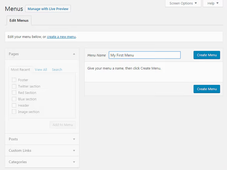
The right side of the screen will change immediately: "Menu Structure" and "Menu Settings" blocks will appear. Since the structure is empty, let's move on to adding content.
You'll unlikely need five or six menus at once. But the option to create separate navigation for the footer or mobile version exists; WordPress doesn't impose any limits on quantity.
Step 2: Adding items to the menu
Now the main focus is on the left panel of the editor. It contains tabs with everything you can add to navigation:
- Pages: a list of all published pages on your site
- Posts: blog posts
- Categories: taxonomies that group your posts
- Custom Links: any URLs, including external sites
For a typical blog, the menu core consists of pages ("About", "Contact", "Services") plus categories ("News", "Guides", "Reviews"). Here's the process:
- Open the desired tab
- Check the boxes next to pages/categories that should appear in the menu
- Click Add to Menu
- Repeat for other tabs
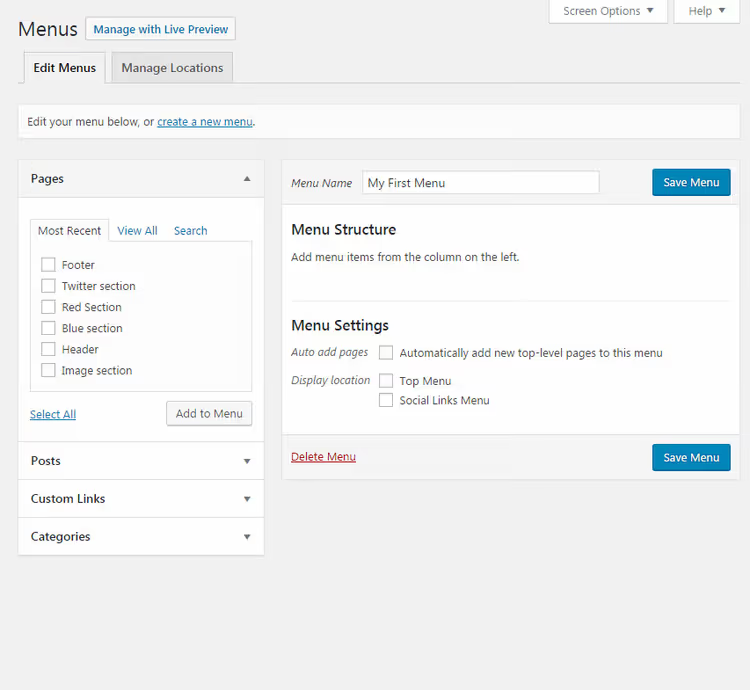
Pages and categories are pulled in automatically; just check the boxes. Custom links work slightly differently: you need the full URL (for example, https://developer.wordpress.org) and a text label (what visitors will see in the menu instead of a bare address).
Note: categories function as post groupings. When a visitor clicks "Guides" in the menu, they land on a page with all posts in that category. For more on how categories work, see this SitePoint article.
Step 3: Arranging order and creating submenus
Once you have at least two items in the right column, you can change their order. WordPress offers two methods.
Drag and drop. Hold an item with the left mouse button and drag it up or down. Items swap positions instantly; the interface works without page reloads.
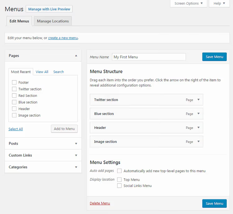
Using the arrow. Click the small arrow to the right of the item name; a card with options will expand:
- Move up / down: shift one position
- To the top / To the start: move to the first row
- **Under **** **: turn into a sub-item (see below)
- **Out from **** **: return to the top level
- Remove: the red link at the bottom of the card removes the item ONLY from the menu without affecting the actual page or post
Submenus are created by simply shifting items to the right. Hold an item, move it slightly to the right of the parent, and it becomes a child. On the site, this item will expand when visitors hover over the parent.
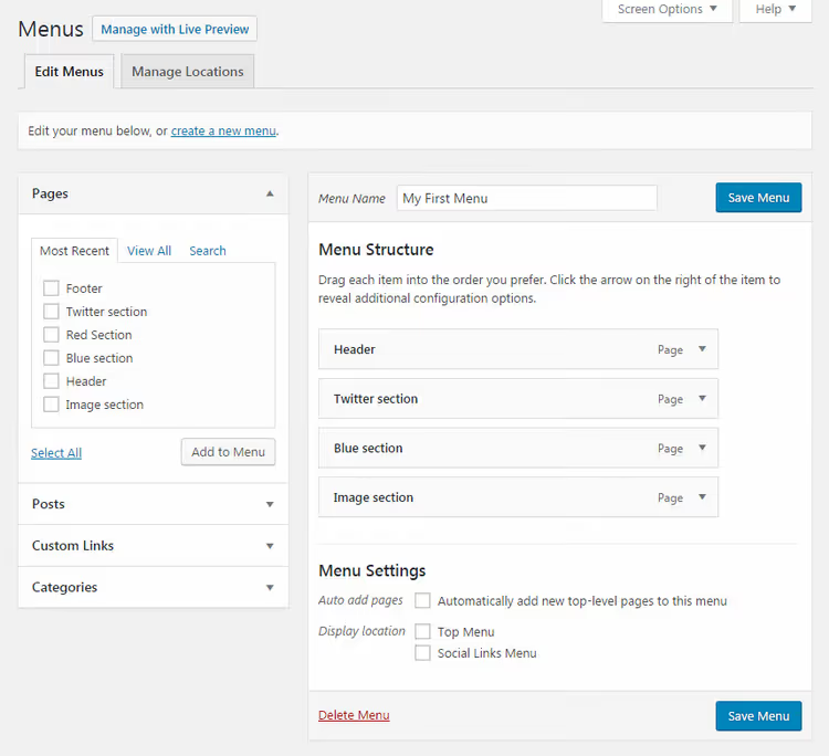
Important: don't overdo the depth. One level of nesting is normal. Two is an edge case for very branched sites. Three is too much: visitors get lost, and on mobile screens such a menu becomes a maze.
You can achieve the same result through the item card: expand with the arrow, click **Under **** **. To reverse, use **Out from **** ** or simply drag left.
Removing an item from the menu doesn't delete the page from your site. Custom links are lost permanently when removed, so if you plan to restore one later, write down the URL separately.
Step 4: Menu settings before saving
Before clicking "Save Menu", check two parameters at the bottom of the right column.
Auto add pages. If enabled, every new top-level page (without a parent) will automatically be added to this menu. On small sites, this option saves time. On sites with dozens of pages, it tends to create chaos; keep it disabled.
Display location. This lists the spots your theme has reserved for menus: primary navigation, footer, mobile menu, and so on. Check the ones you need; a single menu can be displayed in multiple locations.
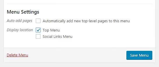
When the structure and settings are satisfactory, click Save Menu. The button appears both at the top and bottom of the editor; they work identically.
Step 5: Advanced options through "Screen Options"
At the very top of the menu editor page, there's a Screen Options tab. Expand it to reveal a list of additional options hidden by default.

What you can enable:
- Tags and post formats: if your theme uses format types (aside, gallery, video), you can add them to the menu as separate items
- Link target: open the item in a new tab (
target="_blank") - CSS classes: custom classes for styling specific items via CSS
- Link relationship (XFN): a microformat for specifying relationships between pages (rarely needed; leave empty)
- Description: text that appears when hovering over an item (depends on the theme)
In practice, the most useful options from this list are opening in a new tab (for external links) and CSS classes (for design tasks). The rest are niche tools that most sites don't touch.
Step 6: Displaying the menu in the sidebar through widgets
If your theme supports widgets, menus can be placed not only in the header but also in the sidebar, footer, or any other widget area.
The process:
- Go to Appearance → Widgets
- Find the Custom Menu widget in the available list
- Drag it to the desired area, for example "Sidebar" or "Footer Widgets"
- In the dropdown, select the menu you created earlier
- Add a title (will appear above the menu in the sidebar) and click Save
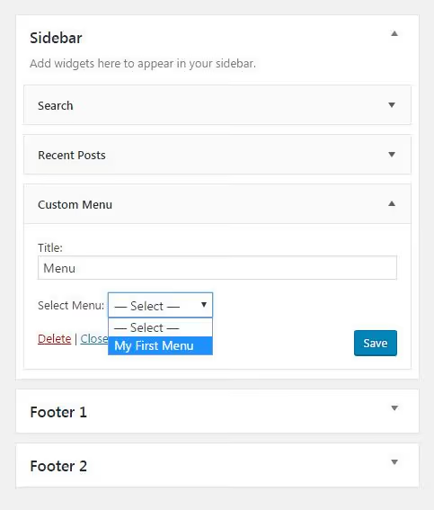
This mechanism works for both older themes using "Classic Widgets" and block-based themes using the site editor; the logic is the same, only the interface changes.
⁉️🤔 Frequently asked questions
Can I create two different menus and display them in different locations?
Yes, without restrictions. Create multiple menus through Appearance → Menus and assign each its own display location. One menu goes in the header, another in the footer, a third in the sidebar through widgets. The number of available positions depends on your theme: typically 2-4 spots.
What if my theme only has one menu location?
Use widgets. Through Appearance → Widgets you can place additional menus in the sidebar or footer, even if the theme doesn't register special positions there. Alternatively, use a plugin for extended navigation; for example, Max Mega Menu adds mega-menus and additional placement options without editing code.
How do I add a menu to the mobile version of my site?
Most modern themes automatically build the mobile menu from the same primary menu. You simply check it in the display locations list, and the theme adapts the display for mobile screens (hamburger icon, dropdown list). If your theme doesn't do this, look in the customizer settings (Appearance → Customize) for a Menus / Mobile Menu section.
Can I add a WooCommerce cart or search button to the menu?
Not with standard tools. By default, only pages, categories, and custom links can be added to menus. For cart icons, search buttons, or login buttons, you need either a specialized plugin (such as Menu Icons by ThemeIsle) or a theme that supports such elements in the customizer settings.
Does the menu break when switching themes?
The menus themselves, no; they're tied to the site, not the theme. But assigned display locations, yes, because each theme registers its own positions with its own names. After switching themes, go to the menu editor and reassign locations in the "Menu Settings" block.
The bottom line: navigation built in six steps
Creating your first menu takes three minutes if you know where to click. In practice, the workflow looks like this: gave it a name → added 4-5 key pages and a couple of categories → arranged the order → saved. That's it. From there you can refine it: submenus for structure, additional placements through widgets, CSS classes for fine-tuned styling.
The main rule: build menus for visitors, not for aesthetics. Three to four clear items are better than ten small ones that nobody understands. If a page is hard to find within two clicks from the menu, something's probably wrong with your navigation.
Check how the menu looks on a phone; one-third of WordPress site traffic comes from mobile devices. A poorly formatted submenu on a smartphone renders all the benefits of navigation useless.

A professional team of writers and editors specializing in creating quality content.