













 AIIllustrative image: AI-generated
🧭 How to customize WordPress menus with code and plugins
The menu is the skeleton of your site. A visitor scans it in seconds: if it's unclear where to click, they leave. The basic WordPress builder under "Appearance → Menus" assembles navigation in a minute, but the result looks like a bare text string. No icons, no sticky behavior on scroll, no proper mobile version.
The problem runs deeper than it appears: the default functionality suffices for the first few days after launch, but soon you need things that simply don't exist in the core. Icons for menu items, a login button right in the navigation, a shortcode for inserting a menu into the post body, a smart mobile panel: all of this requires either code or a plugin.
This article covers both approaches: lightweight tweaks via functions.php and style.css plus the best actively maintained plugins for advanced menus. The material works with classic themes, block themes, and in combination with any popular framework.
💡 Quick overview:
- Install the Menu Icons plugin and add icons to menu items in five minutes without code
- Insert the wp_loginout function into functions.php, and a login button appears right in the navigation
- Register a menu shortcode and output a ready-made menu anywhere on the site
- Make the menu sticky on scroll with three lines of CSS or one of three plugins
- Choose an advanced builder from three options: UberMenu, Max Mega Menu, or QuadMenu
- Set up mobile navigation with WP Mobile Menu or Mobi featuring a touch-friendly interface
1. Menu item icons via Menu Icons
A quick way to enliven navigation: add icons next to section names. The eye "catches" an icon before text, and after a couple of visits the icon sticks in memory better than any label.
The free Menu Icons plugin from the ThemeIsle team handles this task, with 400,000+ active installations on WordPress.org and a 4.4 rating. No code required.
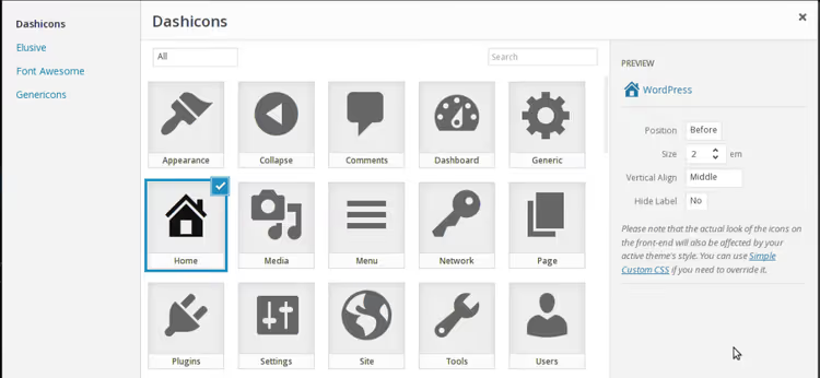
Steps:
- Install the plugin via "Plugins → Add New" and search for "Menu Icons"
- Activate and go to "Appearance → Menus"
- Expand any item, and an icon selection block appears
- Choose an icon from Dashicons (built into WordPress), Font Awesome, or upload your own
- Adjust position and size, then save
Under the hood, the plugin adds a CSS class with the icon to the <li> element: a clean solution with no theme conflicts. It supports Dashicons, Font Awesome, Elusive Icons, and Genericons. Works with any menu registered via the standard wp_nav_menu.
2. Login and logout button right in the menu
If your site has registration, users need quick access without hunting for the /wp-login.php page. A "Log In" or "Log Out" link sits right in the main menu and automatically changes based on status.
This is solved with one function in functions.php:
1 function add_login_logout_link($items, $args) { 2 $loginoutlink = wp_loginout('index.php', false); 3 $items .= '<li>'. $loginoutlink .'</li>'; 4 return $items; 5 } 6 add_filter('wp_nav_menu_items', 'add_login_logout_link', 10, 2);
The snippet hooks into wp_nav_menu_items and appends an <li> with the link to the end of any menu. The wp_loginout() function detects status on its own: if the user is logged out, it shows "Log In"; if authenticated, "Log Out" with a redirect to the same page.
After saving the file, reload the site and verify both states. If you need to redirect the user to a specific page after login, replace the first argument of wp_loginout() from 'index.php' to the desired URL.
3. Shortcode for displaying a menu anywhere
WordPress lets you assign a menu to the header, footer, or sidebar area, exactly where the theme has allocated space. But what if you need a menu inside a post, on a landing page, or in a text widget?
The answer is to register your own shortcode:
1 function menu_function($atts, $content = null) { 2 extract( 3 shortcode_atts( 4 array( 'name' => null, ), 5 $atts 6 ) 7 ); 8 return wp_nav_menu( 9 array( 10 'menu' => $name, 11 'echo' => false 12 ) 13 ); 14 } 15 add_shortcode('menu', 'menu_function');
Add the code to functions.php, save, and anywhere on the site write:
[menu name="main-menu"]
Take the name from "Appearance → Menus," where it appears above the list of items. The shortcode calls the standard wp_nav_menu() with suppressed output ('echo' => false) and returns the finished HTML markup.
This way you can keep common navigation in the footer, additional navigation in the sidebar of a specific post, and assemble a separate menu for a landing page with no theme binding at all.
4. Search field in the navigation bar
The standard WordPress search widget lives in the sidebar. But if there's no sidebar or it shifts to the bottom on mobile, visitors simply won't find the search. Let's move it right into the menu.
Basic version using the same wp_nav_menu_items filter technique:
1 add_filter( 'wp_nav_menu_items','add_search_box', 10, 2 ); 2 function add_search_box( $items, $args) { 3 $items .= '<li>'. get_search_form( false ). '</li>'; 4 return $items; 5 }
The get_search_form(false) function returns the search form HTML without outputting it to the screen. The field will attach to the last menu item; you'll likely need positioning. Add a CSS class to the <li>:
1 $items .= '<li class="searchbox-position">'. get_search_form( false ). '</li>';
And in your theme's style.css specify the margins:
1 .searchbox-position { 2 margin-top: 15px; 3 margin-right: 20px; 4 }
Three lines of PHP and a couple lines of CSS. Result: the search field is always visible at any resolution.
5. Sticky menu on scroll
A sticky menu is when the navigation bar sticks to the top of the screen and travels down the page with the user. It's convenient on landing pages, long articles, and in stores: no need to scroll back to navigate to another section.
Method 1: CSS (free, no plugins)
Find the main menu selector in your theme, usually .nav-menu, .genesis-nav-menu, or .main-navigation. Add to style.css:
1 .nav-menu { 2 position: fixed; 3 background: #333; 4 top: 0px; 5 right: 0px; 6 left: 0px; 7 z-index: 99; 8 }
The key line is position: fixed. It removes the block from the flow and fixes it relative to the browser window. top: 0; right: 0; left: 0 stretches the menu to full width. Add top padding to the content so the menu doesn't cover the header.
The CSS method has one drawback: after fixing, the menu leaves the flow and the content "jumps" up. This is solved by adding padding-top to the body equal to the menu height.
Method 2: plugins (finer control, no code)
If you'd rather not touch theme files, here are three proven tools.
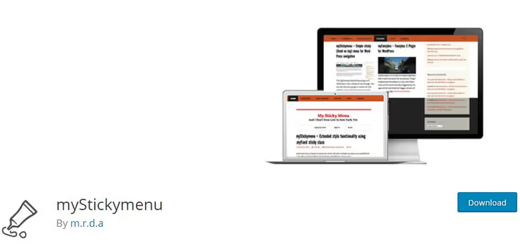
myStickymenu is a free plugin with 200,000+ active installations on WordPress.org and a 4.6 rating. It attaches to your theme's navigation CSS class; just specify it in the settings. It's responsive: on mobile the sticky effect is disabled automatically. There's a field for custom CSS styles and a "stick with delay" mode based on scroll pixels.
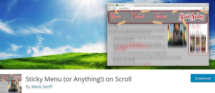
Sticky Menu (or Anything!) On Scroll is another free option that can "stick" any element by CSS selector: not just a menu, but also a logo, entire header, or button. It requires basic understanding of HTML and CSS to find the right selector, but gives complete freedom.
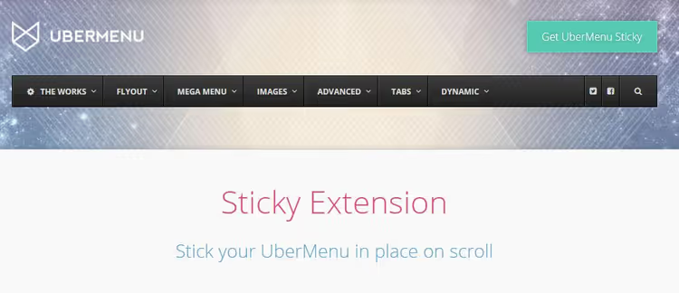
UberMenu Sticky Extension is an add-on to the UberMenu plugin for $8. If UberMenu is already installed, the extension adds sticky mode with one toggle. On mobile it automatically disables to avoid covering the screen.
6. Removing menu items from the WordPress admin
When you hand off a site to a client or give access to authors, the standard admin is too "rich": 10+ sections, many of which the user doesn't need and some are even dangerous. Plugins and theme settings should remain accessible only to administrators.
The code below removes all top-level sections for all users except administrators:
1 if (!current_user_can( 'manage_options' )) { 2 add_action( 'admin_menu', 'my_remove_menus', 999 ); 3 } 4 function my_remove_menus() { 5 remove_menu_page( 'index.php' ); //Dashboard 6 remove_menu_page( 'edit.php' ); //Posts 7 remove_menu_page( 'upload.php' ); //Media 8 remove_menu_page( 'edit.php?post_type=page' ); //Pages 9 remove_menu_page( 'edit-comments.php' ); //Comments 10 remove_menu_page( 'themes.php' ); //Appearance 11 remove_menu_page( 'plugins.php' ); //Plugins 12 remove_menu_page( 'users.php' ); //Users 13 remove_menu_page( 'tools.php' ); //Tools 14 remove_menu_page( 'options-general.php' ); //Settings 15 }
The snippet goes in functions.php. The !current_user_can('manage_options') check excludes administrators; they see everything. Other roles get a trimmed list based on what you leave in.
Remove only the remove_menu_page lines you need. For example, for an editor you might leave "Posts," "Media," and "Pages" while removing everything else. Important note: the function hides items from the menu but doesn't block direct URL access. For full page lockdown, configure capabilities in the user role.
7. Advanced plugins for menu creation
When the standard editor isn't enough, you need mega menus with images, tabs, forms, and dynamic elements. Here are three actively maintained plugins for different tasks and budgets.
7.1 UberMenu: the most feature-rich builder
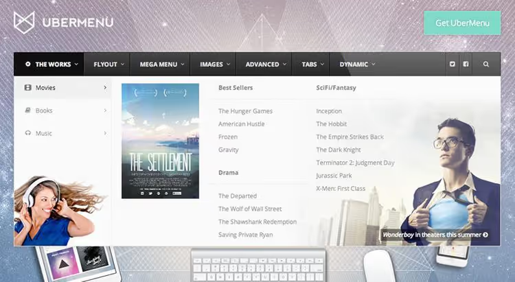
A market veteran with 43,000+ sales on CodeCanyon. Creates responsive mega menus with touch support. You can place images, video, maps, and a ready-made contact form inside submenus. Over 50 style settings with live preview, automatic submenu generation from content, and tabs under items. Integrates with WooCommerce: can dynamically pull product categories.
Price: from $26. 🔗 UberMenu on CodeCanyon
7.2 Max Mega Menu: the free leader

The most popular free mega menu plugin on WordPress.org: 400,000+ active installations and a 4.8 rating. Builds mega menus via drag-and-drop in the standard "Appearance → Menus" screen with no separate interface. Supports column grids, widgets inside submenus, icons, and off-canvas mode for mobile. The frontend script weighs under 2 KB gzipped, so it doesn't affect site speed.
- Pros: integrated into the native WordPress menu interface, minimal script weight, widgets inside submenus, free version covers 90% of use cases
- Cons: some advanced styles and tab menus only in Pro ($29/year)
- Price: Free / Pro from $29/year
- Download: 🔗 Max Mega Menu on WordPress.org
7.3 QuadMenu: tabs, carousels, and full customization

QuadMenu transforms the standard menu into a mega menu with tabs and carousels, offering more features than Max Mega Menu but with a slightly higher learning curve. Supports vertical and horizontal layouts, integration with Elementor and Beaver Builder, Google Fonts, and 2,000+ Font Awesome icons. Dark and light themes out of the box, responsive mobile version with off-canvas panel.
- Pros: tabs and carousels inside the menu, deep integration with page builders, developer-friendly (hooks and filters)
- Cons: more complex initial setup than Max Mega Menu, some features only in the paid version
- Price: Free / Premium from $15/year
- Download: 🔗 QuadMenu on WordPress.org
8. Mobile menus for smartphones and tablets
Mobile traffic overtook desktop long ago. If the menu turns into an unreadable mess on a phone, visitors leave. A responsive theme scales the desktop menu for narrow screens, but the structure stays the same: five or six items in a row become a long vertical list. A specialized plugin provides a hamburger button, swipes, and touch optimization.
8.1 WP Mobile Menu: quick off-canvas for any site

The most popular free mobile menu plugin on WordPress.org: 80,000+ active installations and a 4.7 rating. Adds an off-canvas panel that slides out when the hamburger button is tapped. Supports three nesting levels, search inside the mobile menu, icons, and color customization. Behavior for different screen resolutions is configured separately.
- Pros: minimal setup (works immediately after activation), adaptive (shows only on mobile), doesn't conflict with themes
- Cons: some advanced styles and WooCommerce integration in Pro ($19/year)
- Price: Free / Pro from $19/year
- Download: 🔗 WP Mobile Menu on WordPress.org
8.2 Mobi: drag-and-drop mobile menu builder
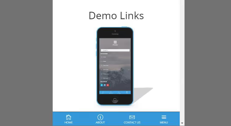
An intuitive drag-and-drop menu builder. The menu can be placed at the top or bottom of the screen. Includes 700+ built-in icons, any number of social media icons on the panel, and Google Fonts for styling. You can control menu visibility for guests and logged-in users separately. Well suited for sites where the mobile menu should look like a standalone interface rather than a shrunken copy of the desktop version.
Price: from $16. 🔗 Mobi on CodeCanyon
⁉️🤔 Frequently asked questions
Can I create a menu entirely without plugins, just with code?
Yes, all the techniques described (icons, sticky effect, shortcode, login button) can be implemented via
functions.phpandstyle.csswithout installing third-party tools. Plugins simply save time and provide a graphical interface for those who prefer not to touch code. If you're comfortable with PHP and CSS, plugins aren't required. But when you need mega menus or an off-canvas panel with animations, a ready-made plugin saves hours of manual coding.
Which plugin should I choose for a WooCommerce store?
For a store, a mega menu with product categories, images, and filters is critical. UberMenu performs best here: it dynamically pulls WooCommerce categories and builds submenus on the fly. A free alternative is Max Mega Menu with widgets inside submenus: category images are pulled via the standard WooCommerce widget, and search gets a separate row.
What should I do if the site stops loading after adding code to functions.php?
Restore the original file via FTP or your hosting's file manager. Before any edits to
functions.php, make a backup. An alternative safe approach is the Code Snippets plugin: it lets you add PHP snippets through the admin and automatically disables code on fatal error, returning the site to working order.
Do I need to update the menu after changing WordPress themes?
Menus are tied to a display area (location) that the theme registers. When you change themes, these areas change, and you need to reassign the menu in "Appearance → Menus" on the "Manage Locations" tab. The items themselves, their order and nesting, are preserved; only the location binding is lost.
How do I verify that the mobile menu works on all devices?
Open the site in responsive design mode in Chrome DevTools (F12 → device icon) and go through six breakpoints: 320px, 375px, 414px, 768px, 1024px, 1280px. Check the hamburger button (should be above content, not covered), animation response speed, and visibility of all menu items without horizontal scrolling. Popular plugins like WP Mobile Menu let you manually set the breakpoint, allowing you to specify different trigger widths for your specific theme.
What to use for your task: the final breakdown
In short: first exhaust WordPress's built-in capabilities and lightweight CSS tweaks, then add plugins. This keeps the stack minimal, the site fast, and the navigation exactly what readers need.
- Simple blog or business card site: start with Menu Icons (free) and sticky menu with three lines of CSS. That's enough to make navigation stop looking raw.
- Site with registration: add a login button via
wp_loginout(). Users will stop hunting for the login page. - Landing page or long article: the
[menu]shortcode places navigation blocks anywhere in the page body. - E-commerce store or content portal: you need a mega menu here. Go with UberMenu if budget allows and you need maximum features, or Max Mega Menu for typical tasks (free and without speed loss).
- Mobile audience dominates: WP Mobile Menu covers 9 out of 10 scenarios: installs in a minute and immediately provides an off-canvas panel with search. If you need a more standalone mobile interface, check out Mobi.
Make it a rule: one plugin per task. Don't install a mega menu just for a couple of icons, and don't write code for an off-canvas panel when a plugin does it in a minute. The balance between site speed and navigation convenience is exactly what keeps readers on the page.

A professional team of writers and editors specializing in creating quality content.