














🔍 4 mobile responsive menu plugins for WordPress in 2026
Mobile traffic surpassed desktop back in 2018, and by 2025, according to Statista, smartphones and tablets accounted for 58% of website visits. Yet the average WordPress site menu still operates on 24-inch monitor logic: a dozen links in a row, three levels of nesting, hover-triggered dropdowns. On a 375-pixel-wide screen, tapping the right item on the first try is nearly impossible.
The problem isn't the theme or WordPress itself. The standard wp_nav_menu() function doesn't distinguish between devices; it outputs identical markup for both desktop and mobile. The plugins in this review intercept menu output and restructure it for mobile screens: no code edits, no theme replacement, no developer required.
Below are four tools we tested on live sites in June 2026: from a simple hamburger with minimal settings to a mega menu with maps and WooCommerce widgets inside the navigation. Plus the rules without which even the best plugin won't make your menu user-friendly.
💡 Quick overview:
- Install Responsive Menu if you need 150+ settings and full visual control over your menu
- Choose Max Mega Menu when your menu needs to work equally well on all devices, from phones to 4K monitors
- Go with UberMenu for commercial projects where navigation directly impacts conversion
- Use WP Responsive Menu for simple sites where set-it-and-forget-it is enough
Mobile menu rules: what works in 2026

Before installing a plugin, here are four principles without which mobile navigation will remain frustrating. They don't depend on any specific tool and come from hands-on experience across dozens of sites.
Rule 1: no more than five items. On desktop, a menu with 12 links looks fine. On a smartphone, it's an endless scroll that nobody will finish. Keep only what matters most: services, contact, blog, about. Everything else goes in the footer or on internal pages.
Rule 2: contacts front and center. Mobile visitors are usually looking for a phone number, address, or contact form. Google research showed that 55% of users say a poor mobile experience directly harms brand perception. Place contacts at the top of the menu or as a separate button; don't make people scroll for them.
Rule 3: minimal taps. The ideal is two taps to any page. Open menu, tap section, land on page. Three levels of nesting on mobile is a failure: users get lost and leave without finding what they need.
Rule 4: hamburger with a label. Three lines in the corner are recognizable, but add the word "Menu" when possible. And make sure the tap target is large enough for a thumb to hit without missing: if the icon is smaller than a fingertip, users will miss and leave the site.
4 responsive menu plugins: comparison
Product | Type | Active installs | Rating | Price | Key feature |
|---|---|---|---|---|---|
Responsive Menu | Free / Pro | 80,000+ | 4.4★ | Free / Pro from $29/year | 150+ settings and live preview |
WP Responsive Menu | Free / Pro | 30,000+ | 4.3★ | Free / Pro from $19 | Simplicity: install and it works |
Max Mega Menu | Free / Pro | 400,000+ | 4.8★ | Free / Pro from $29/year | Mega menu and responsiveness out of the box |
UberMenu | Premium | N/A | 4.6★ | $25 one-time | Content inside menu: maps, forms, icons |
1. Responsive Menu

The most customizable free plugin for mobile menus in the WordPress.org directory. Developer ExpressTech Systems has maintained it since 2014, and as of June 2026, the plugin receives updates every two to three months. The latest version 4.7.2 was released in May 2026.
In practice, this isn't just enabling a hamburger menu; it's a full-fledged builder. Colors, fonts, sizes, button position, slide direction (left, right, top, bottom), opening animation: everything is configurable from the admin panel with live preview. Change a parameter and see the result instantly without page refresh.
Multi-column layout inside the menu deserves special mention: links are grouped and placed side by side, as in a desktop layout, but on a mobile screen. The plugin works with WPML and Polylang for multilingual sites. The Pro version adds social icons, in-menu search, and WooCommerce integration.
- Pros: live preview without page refresh, 150+ settings in the free version, active development (May 2026), RTL and multilingual support, multiple columns in menu.
- Cons: on weak hosting the plugin admin can lag due to the volume of settings, Pro features (social, search) are behind a paywall.
- Price: Free version on WordPress.org. Pro from $29/year at responsive.menu.
- Download: 🔗 Responsive Menu on WordPress.org | 🔗 Live demo
2. WP Responsive Menu
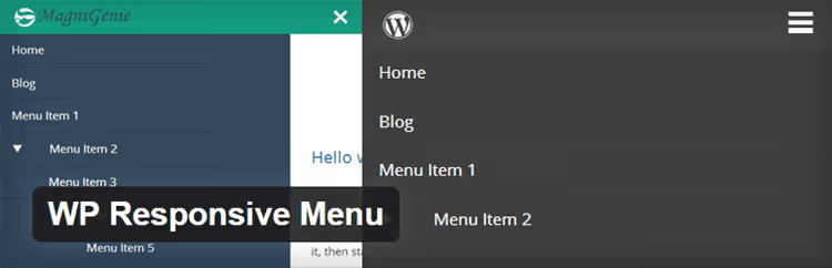
If Responsive Menu is a builder, WP Responsive Menu from MagniGenie is a switch: flip it on and forget about it. 30,000+ active installs and a 4.3★ rating confirm that for most sites, it's enough.
The plugin adds a slide-out menu with basic settings: slide direction, logo in the menu header, hiding specific items on mobile, in-menu search. Setup takes less than a minute: select a menu from the list, choose the slide direction, save, and it works with any theme.
The Pro version adds social icons, WooCommerce support, and Google Fonts customization. But honestly, if you need all these features, look at Responsive Menu, where they're implemented more thoroughly and without extra charges for each one.
The plugin was updated in June 2026 (version 3.2.1), but some users complain about slow support response. For a business card site or landing page, it's more than enough. For a project where the menu is critical, see option 1 or 3.
- Pros: minimal setup (under a minute), works with any theme, swipe gestures for opening and closing, no conflicts with Genesis and Thesis.
- Cons: support responds slowly, Pro features are more modest than competitors', infrequent updates.
- Price: Free version on WordPress.org. Pro from $19.
- Download: 🔗 WP Responsive Menu on WordPress.org
3. Max Mega Menu

The most popular menu plugin in the WordPress directory: 400,000+ active installs and a 4.8★ rating. As of June 2026, version 3.10.5. The main difference from the first two is that Max Mega Menu doesn't just adapt menus for mobile; it transforms a standard WordPress menu into a mega menu with columns, icons, and widgets.
For the mobile version, this provides an unexpected benefit: the menu you build for desktop automatically collapses into a hamburger on smartphones. No need to configure two versions; one structure works everywhere. The built-in drag-and-drop editor lets you drag items into columns, add icons, and save.
The plugin works with any WordPress menu, doesn't require theme replacement, and correctly handles up to three levels of nesting. On mobile screens, submenus open on tap rather than hover: a critical detail for phones that many "responsive" themes miss.
- Pros: 400,000+ installs and 4.8★ rating, drag-and-drop editor, automatic mega menu adaptation for mobile, works with any theme, built-in Dashicons.
- Cons: mega menu setup is more complex than a simple hamburger menu, overkill for business card sites.
- Price: Free version on WordPress.org. Pro from $29/year.
- Download: 🔗 Max Mega Menu on WordPress.org
4. UberMenu
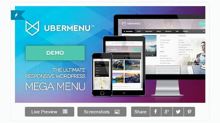
The only fully premium plugin in this roundup. UberMenu sells on CodeCanyon for $25 (one-time license, not a subscription) and does things with menus that standard wp_nav_menu() could never dream of: Google maps, contact forms, icons, product images, all inside the navigation bar.
Configuration happens through WordPress Customizer: you see the menu in real time and change any parameter, from column width to separator color. No code, no CSS hacks. For mobile devices, UberMenu automatically restructures the mega menu into a vertical list with expandable submenus and touch input support.
The plugin receives regular updates, documentation is thorough, and support responds. But the $25 price and lack of a free version mean UberMenu is worth considering only for commercial projects: online stores, catalogs, corporate sites, where navigation carries direct commercial weight.
- Pros: any content type inside the menu (maps, forms, images), Customizer configuration with live preview, one-time license without subscription, regular updates.
- Cons: no free version (only $25), overkill for blogs and business cards, requires time to master all features.
- Price: $25 one-time license on CodeCanyon.
- Download: 🔗 UberMenu on CodeCanyon | 🔗 UberMenu demo
How to set up a mobile menu in 10 minutes
Theory and a plugin list are half the job. The other half is seeing the process with your own eyes. This video shows complete responsive menu WordPress setup from scratch: from plugin installation to publishing.
⁉️🤔 Frequently asked questions
Do I even need a separate plugin for mobile menus? Modern themes are responsive anyway.
A responsive theme adapts layout, grid, fonts, columns. But the menu remains the same
wp_nav_menu(), just styled for mobile screens via media queries. When you have 8-10 menu items with nesting, CSS rules alone aren't enough; you need a different navigation structure. A plugin doesn't "fix" the theme; it replaces the menu display logic for mobile devices.
Which plugin should I choose for a WooCommerce store?
If budget isn't limited, UberMenu. Product cards, prices, and the "Add to Cart" button right in the menu: that's conversion, not just navigation. If you need a free start, Max Mega Menu: it integrates with WooCommerce out of the box and displays products in the mega menu via widgets without additional plugins.
Does the plugin hurt SEO? The menu gets indexed, after all.
No, if the plugin is well-built. Responsive Menu, Max Mega Menu, and UberMenu don't hide menus via
display:nonefrom search engines. Menu markup stays in the DOM; Google sees and indexes it. The problem is with plugins that render menus via client-side JavaScript, but none in our roundup do that.
Can I use two menu plugins simultaneously?
You can, but you shouldn't. Two plugins modifying
wp_nav_menu()will almost certainly conflict: one intercepts the filter, the other fails to fire, or both apply and the menu breaks. Experience on test sites shows: choose one tool and configure it for all devices.
How do I verify that the menu is actually convenient on a phone?
Open the site on a real smartphone, not in Chrome DevTools emulator. Try using one hand with your thumb to tap every item. If even one requires "aiming," the tap target is smaller than 48 pixels and needs to be larger. Navigate from the homepage to the deepest page: if it takes more than 5 seconds or 3 taps, simplify the structure.
What should I do if the menu breaks after installing the plugin?
First: check the browser console for JavaScript errors (F12, Console tab). A common cause is a conflict with the theme's jQuery version or another plugin. Second: temporarily switch to a standard WordPress theme (Twenty Twenty-Five); if the menu works, the problem is with the theme, not the plugin. Third: disable caching plugins during setup, otherwise you're seeing the old menu version.
What to install: the final verdict
Four plugins cover the entire spectrum of needs, from landing pages to online stores. The choice comes down to three scenarios:
If you need maximum settings for free, install Responsive Menu. 150+ options, live preview, active development with updates every two to three months. The best value (free) in the WordPress.org directory.
If your menu needs to be unified for desktop and mobile, your choice is Max Mega Menu. 400,000+ installs and a 4.8★ rating don't lie: the plugin works equally well on all screens, and the drag-and-drop editor saves hours of coding.
If budget allows and the menu is a key conversion element, buy UberMenu. Maps, forms, and products inside navigation pay back the $25 from the first order.
Save WP Responsive Menu for "install and forget" cases: a business card site, a five-page landing, a blog with simple structure.
If you're rebuilding your site structure, here's a guide to WordPress menu setup with code and plugins. And once your menu is ready and it's time for overall mobile optimization, check out the collection of plugins for mobile WordPress sites.

A professional team of writers and editors specializing in creating quality content.