














🔍 The mysterious inline-flex: what it is and how it differs from display: flex
What is display: inline-flex
Flexbox has become a staple of everyday web layout. Every front-end developer knows and uses display: flex. But this property has a lesser-known sibling, display: inline-flex. It's rarely written about and used even less often. That's a mistake.
The difference boils down to one sentence: inline-flex creates a flex container that behaves like an inline element itself. Its children are ordinary flex items with all the capabilities of Flexbox. The parent, however, does not take up the full available width of the line. It adjusts to the size of its content and sits in the same row as neighboring elements.
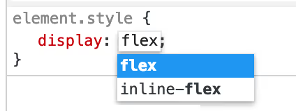
The situation is exactly like the pair display: block and display: inline-block. A block element takes up the entire line, an inline element takes only as much as the content needs. The same applies here: flex sets up a block-level flex container, while inline-flex sets up an inline-level one.
In practice, this opens up scenarios that would require extra wrappers, width hacks, or float relics with regular flex.
💡 Quick overview:
display: inline-flexcreates a flex container that behaves like an inline element and does not take up the entire line. The width of such a container is determined by its content, not its parent.- All flex properties work inside
inline-flexexactly the same way as in regulardisplay: flex. There are no differences in how children are laid out; the only difference is in the external behavior of the container. - The primary use case: badges, tags, and buttons with icons, where a single
inline-flexon the element replaces the combination of a flex parent and an inline child. You get content centering without extra wrappers. - Other display values also have inline counterparts:
inline-block,inline-table, andinline-gridwork on the same principle. The internal layout logic is preserved; only the external behavior of the container changes.
Real-world case: badges with icons
Imagine a typical task. A page needs a row of badges. Each one has an icon and text, with the icon centered vertically and horizontally inside a colored circle. The badges themselves sit in a line like regular text and wrap to the next line when they don't fit.
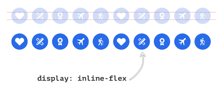
If you set display: flex on the badges, each one will stretch to the full width of the parent. The badges will line up in a column, not a row. You can fix this with a wrapper that has display: flex on the parent. But why add an extra wrapper when you have inline-flex?
The HTML structure is elementary:
1 <div class="badges-list"> 2 <span class="c-badge"> 3 <svg class="c-icon" width="24" height="24">...</svg> 4 </span> 5 <span class="c-badge"> 6 <svg class="c-icon" width="24" height="24">...</svg> 7 </span> 8 <!-- other badges --> 9 </div>
Note that the wrapper .badges-list does nothing for inline positioning. The .c-badge itself handles that.
CSS for the badge:
1 .c-badge { 2 display: inline-flex; 3 justify-content: center; 4 align-items: center; 5 }
That's it. Each badge is a flex container with inline behavior. The icon inside is centered using justify-content and align-items. The badges themselves line up in a row and wrap to a new line when there isn't enough width. Exactly what the design required, without extra wrappers.
inline-flex vs flex: a visual comparison
The best way to understand the difference is to look at two identical sets of containers, one with display: flex and the other with display: inline-flex.
Example 1: display: flex
Three parent containers with a blue background. Inside each one are three red children with flex: 1. The parents have display: flex.
Result: each blue container takes up the entire line. The children inside stretch to equal width. The containers are stacked in a column, one below the other.
1 .container--flex { 2 display: flex; 3 } 4 5 .container--flex > div { 6 flex: 1; 7 }

Example 2: display: inline-flex
The same three containers, but with display: inline-flex. The children have min-width: 50px added so the container doesn't collapse to zero.
1 .container--inline-flex { 2 display: inline-flex; 3 } 4 5 .container--inline-flex > div { 6 flex: 1; 7 min-width: 50px; 8 }
Result: the containers sit in a single row. Each takes up exactly as much width as its children need (50px × 3 = 150px). They behave like words in a sentence and wrap to the next line only when space runs out.

The key takeaway: for flex items inside the container, there is no difference whatsoever. Properties like justify-content and align-items, as well as gap and flex-direction, work identically. The only difference is how the container itself interacts with the outside world: as a block or as an inline element.
When to use inline-flex: 4 scenarios
Not every layout requires inline-flex. But there are situations where it solves the task more elegantly than the combination of flex + wrapper.
1. A list of tags or badges. The most common use case. Each tag is a flex container with an icon and text aligned at the center. The tags themselves flow in a line with wrapping. inline-flex on the tag, and no wrappers needed.
2. Buttons with icons in a line of text. When an action button (copy, open, delete) sits directly inside a paragraph or heading. inline-flex lets you center the icon inside the button without pulling the button out of the text flow.
3. An inline toolbar. A set of formatting buttons in a WYSIWYG editor. Each button is an inline-flex container with an icon inside. All buttons sit in a line and wrap naturally.
4. Vertical centering in an inline context. A classic CSS pain point: centering an icon vertically relative to adjacent text. vertical-align: middle works sporadically. inline-flex with align-items: center works every time.
Here's the code for scenarios 2 and 3, so they don't remain theoretical.
Button with icon in text (scenario 2). Suppose you need a "copy" button inside a paragraph. It must stay in the text flow and not break the line. Here's the minimal CSS:
1 .inline-action-btn { 2 display: inline-flex; 3 align-items: center; 4 justify-content: center; 5 width: 24px; 6 height: 24px; 7 border: none; 8 background: transparent; 9 cursor: pointer; 10 vertical-align: middle; 11 }
Three lines of flexbox centering, and the icon inside the button is aligned on both axes. No line-height hacks, no position: relative plus transform. The button sits right in the text like another word.
Toolbar (scenario 3). A typical WYSIWYG editor: bold, italic, and link buttons sit in a row. Each button is an inline-flex container:
1 .toolbar__btn { 2 display: inline-flex; 3 align-items: center; 4 justify-content: center; 5 width: 32px; 6 height: 32px; 7 border-radius: 4px; 8 }
The buttons wrap when the window narrows, without additional wrappers. For the parent toolbar, display: flex with flex-wrap: wrap and gap: 4px works well. You get a two-level flex composition: the outer container manages the row of buttons, and each button centers its icon.
Pitfalls of inline-flex
Three non-obvious situations that save hours in DevTools.
Whitespace between elements. Like inline-block, elements with inline-flex are sensitive to whitespace in HTML. Three <span> elements with inline-flex on separate lines will have a gap of 4-5 pixels. The fix: font-size: 0 on the parent with restoration on children, removing whitespace between tags, or a combination of display: flex on the parent plus inline-flex on children.
text-align doesn't work on flex children. For inline-block, elements are aligned via text-align: center on the parent. With inline-flex, this technique works only as long as the children haven't become flex containers themselves. Flex items don't respond to text-align. Align containers via justify-content on a flex parent or margin: auto.
Default flex direction. inline-flex, like display: flex, lays out children in a row by default (flex-direction: row). If you expect a column inside an inline container, set flex-direction: column explicitly. The specification doesn't read the developer's mind.

Relatives: other inline display variants
inline-flex has conceptual siblings. Almost every block display value has an inline counterpart:
Block value | Inline counterpart |
|---|---|
|
|
|
|
|
|
|
|
The mechanism is the same everywhere: the internal layout logic is fully preserved, only the external behavior of the container changes. With inline-grid, the story is the same: a grid container that sits in a row rather than taking up the full width of the parent.
In practice, inline-flex is used more often than inline-grid. The reason is simple: flex containers are more commonly needed for small components (badge, button, group of icons), where inline behavior is exactly what's needed. Grid layouts are more often applied to large structural blocks, where inline behavior serves no purpose.
Browser support for inline-flex is practically complete. The property appeared in the Flexible Box Layout Module Level 1 specification (W3C Candidate Recommendation, 2016) and works in all modern browsers: Chrome since version 29 (2013), Firefox since version 20 (2013), Safari since version 9 (2015), and Edge since version 12 (2015). Internet Explorer 11 supports inline-flex with caveats, but according to StatCounter data for 2025, the IE11 share is less than 0.1% of the global market. For projects that must support IE11, test inline-flex manually: this browser behaves unpredictably with some flex-basis and min-height bugs.
⁉️🤔 Frequently asked questions
What's the difference between display: inline-flex and display: flex?
display: flexcreates a block-level flex container that takes up the full available width of the line.display: inline-flexcreates an inline-level flex container whose width is determined by its content and can sit on the same line as other elements. For children inside the container, there is no difference: all flex properties work the same in both cases.
When is inline-flex better than inline-block?
inline-blockgives you no control over child alignment. If you need to center an icon inside a button both vertically and horizontally,inline-blockwill force you to rememberline-heighthacks andvertical-align.inline-flexwithjustify-content: centerandalign-items: centerdoes this without jumping through hoops.
Can you use gap with inline-flex?
Yes,
gapworks ininline-flexexactly the same way as in regularflex. You set the spacing between flex items, and the browser applies it regardless of whether the container is block-level or inline-level. Support forgapin flexbox: all modern browsers since 2021.
Does inline-flex affect nested flex containers?
No. The
displayproperty is not inherited. If an element withdisplay: flexis inside aninline-flexcontainer, it will be a regular block-level flex container. Inline behavior applies only to the element you explicitly setinline-flexon.
*inline-flex** and accessibility: are there any pitfalls?*
Screen readers make no distinction between
flexandinline-flex. Both values affect only visual layout and do not change semantics or reading order. The flex propertyorderchanges the visual order but not the order in the accessibility tree; this is true for bothdisplayvalues.
What to use: flex or inline-flex
The choice comes down to a simple question: should the container sit in a line with its neighbors or take up the full width of its parent?
If you're styling a component (badge, button with icon, tag, toolbar item), use inline-flex. You'll get flex centering of content while preserving natural inline behavior without additional wrappers.
If you're styling a section, card, header, footer, or layout, stick with display: flex. Block behavior is appropriate here: the container should take up its line, not squeeze in between neighboring elements.
The golden rule: open DevTools and look at the element. If it's on a line with others, use inline-flex. If it's on its own line, use flex. It's that simple.

A professional team of writers and editors specializing in creating quality content.