













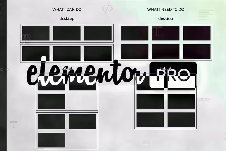
📱 Elementor: configuring columns on tablets without breaks and wrapping
When building a landing page on Elementor, the desktop grid looks perfect: three columns, strict order, everything breathes. Open it on a tablet, and the third column flies down, breaks the rhythm, leaves a gap on the right. Sound familiar?
Elementor by default wraps columns that don't fit in a row on narrow screens. But what if on a tablet you need not three, but exactly two columns per row, without breaks and without empty space? Or on mobile, not one, but two?
Below are two working methods: built-in (for Elementor 2024+ versions) and custom CSS (for full control over any versions). Both are tested and don't conflict with DOM optimization.
💡 Quick overview:
- Set column widths in Elementor through the Advanced tab for each breakpoint separately
- If standard settings aren't enough, add custom CSS with flex-wrap and media queries
- Check the layout on all devices: columns rearrange without breaks and empty spaces
The process is clearly shown in this video:
1. Built-in method: responsive column widths
Starting with Elementor 3.18+ (and especially with the transition to Flexbox containers in 2024), you can control column widths on each device without a single line of code.
Create a section with columns
Add a new section and choose a three-column structure:
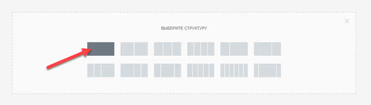
Duplicate each of the three columns to get six. This is needed so that on tablets the columns rearrange into two rows of two, rather than leaving the third one alone:
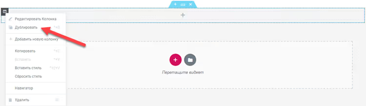
To see the layout, fill the columns with numbers using the "Heading" widget, so the preview immediately shows which one went where:

Setting width for each device
Go to the settings of each column → Advanced tab. In the Width section, switch to responsive mode (tablet/phone icon) and set values according to Elementor documentation:
- Desktop: three columns per row (width will be divided automatically)
- Tablet: two per row
- Mobile: one per row (or two, if you also need two on mobile)
Key point: width is set for each of the six columns separately, Elementor applies the value to all columns within one section. There won't be any wrapping because on tablets six columns give exactly two rows of two.
2. Custom CSS: full control
The built-in method covers most scenarios, but sometimes you need a different number of columns on tablets (2 instead of 3), and on mobile, non-standard (2 instead of 1). Or you have an old version of Elementor without responsive widths. Then, CSS.
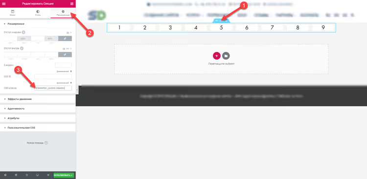
Assign a CSS class to the section
Open section settings → Advanced tab → CSS Classes field. Enter a unique class, for example, elementor-custom-columns:
Add CSS rules
Insert the code in section settings (Advanced tab → Custom CSS) or in the theme customizer (Appearance → Customize → Additional Styles). Here's the current version:
1 selector.elementor-custom-columns .elementor-container { 2 flex-wrap: wrap; 3 justify-content: center; 4 }
Now, column widths for each device through media queries. For sections (Sections) use the .elementor-top-column selector, for containers (Containers), .e-con-inner > .e-con:
1 /* Base: three columns on desktop */ 2 .elementor-custom-columns .elementor-top-column { 3 width: 33.33%; 4 } 5 6 /* Tablet: two columns */ 7 @media (min-width: 768px) and (max-width: 1024px) { 8 .elementor-custom-columns .elementor-top-column { 9 width: 50%; 10 } 11 } 12 13 /* Mobile: one column */ 14 @media (max-width: 767px) { 15 .elementor-custom-columns .elementor-top-column { 16 width: 100%; 17 } 18 }
What's happening here: flex-wrap: wrap allows column wrapping when they don't fit in a row, and justify-content: center centers the remaining columns (without a gap on the right). Media queries override the width at each breakpoint, exactly as many columns per row as needed.
Result on devices
On desktop, three neat columns:

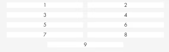
On tablet, exactly two per row, without breaks and gaps:
On mobile, one column at full width:
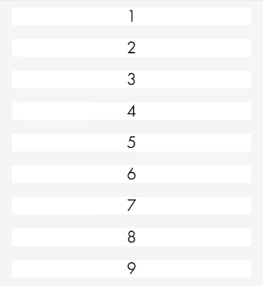
For those who enabled DOM optimization
If in Elementor settings (Elementor → Settings → Experiments) the Improved DOM Optimization option is active, selectors change, .elementor-row disappears. Adapted CSS for this mode:
1 selector.elementor-custom-columns { 2 display: flex; 3 flex-wrap: wrap; 4 justify-content: center; 5 } 6 7 .elementor-custom-columns .elementor-top-column { 8 width: 33.33%; 9 } 10 11 @media (min-width: 768px) and (max-width: 1024px) { 12 .elementor-custom-columns .elementor-top-column { 13 width: 50%; 14 } 15 } 16 17 @media (max-width: 767px) { 18 .elementor-custom-columns .elementor-top-column { 19 width: 100%; 20 } 21 }
A verified code example for this scenario is also available in GitHub Gist from oooh-boi, working, tested on Elementor 3.19+ with DOM optimization enabled.
Which method to choose: comparison table
Criterion | Built-in responsive width | Custom CSS |
|---|---|---|
Entry barrier | No code, UI settings | Basic CSS knowledge needed |
Flexibility | 2-3-4 columns per breakpoint | Any layout, including 5+ |
Compatibility | Elementor 3.18+, Flexbox containers | All Elementor versions |
DOM optimization | Works out of the box | Selector adaptation needed |
Setup speed | 2-3 minutes | 5-10 minutes with debugging |
If you have a recent version of Elementor and a standard grid (2-4 columns), use the built-in method, it's faster and doesn't require CSS. If you need a non-standard layout, you're using an old plugin version or enabled DOM optimization, custom CSS gives you full control.
⁉️🤔 Frequently asked questions
Why do columns wrap with a break on tablets?
Elementor by default uses
flex-wrap: nowrapfor the column row. When three columns don't fit in tablet width, a break forms: second column on the first row, third goes to the second and remains alone. Withflex-wrap: wrapand column widths at half the row on tablets, six columns fit exactly into three rows of two, without breaks.justify-content: centercenters columns if there are fewer than needed in the last row. Solution: either responsive width through UI (method 1), orflex-wrap: wrapwith media queries (method 2).
Does the method work with containers (Flexbox Containers)?
Yes, but selectors are different. For containers instead of
.elementor-top-columnuse.e-con-inner > .e-con, and instead of.elementor-container, the container itself. Built-in responsive method (#1) works with containers without edits.
Is it mandatory to duplicate columns?
Yes, if on tablets you need fewer columns per row than on desktop. For example: desktop, 3 columns, tablet, 2. Three original columns can't be rearranged into two neat rows of two. Six columns (each duplicated) rearrange into three rows of two.
Does this conflict with caching plugins?
CSS rules added through section Custom CSS or customizer get into inline styles or
wp_head, they pass through any cache plugin (WP Rocket, W3 Total Cache, LiteSpeed) without problems. After changing CSS, clear the cache.
What to do if columns are too narrow on mobile?
Check that width isn't inherited from the tablet breakpoint. In Elementor settings are cascading: mobile inherits tablet, tablet inherits desktop. Explicitly set width at each breakpoint, even if the value matches the higher one.
Is it worth bothering with CSS in 2026?
Elementor's built-in responsive settings are enough for most tasks, use them as the main tool. But when on tablets you need not two and not three, but say, four columns with unequal widths, custom CSS remains the only way to do exactly what's intended.
Try both methods on a test page: start with the built-in (faster), and if you lack flexibility, use the CSS approach. The skill of setting up media queries for Elementor will be useful for other tasks: custom fonts on devices, hiding blocks, non-standard spacing for tablets.

A professional team of writers and editors specializing in creating quality content.