













🚀 How to create a mega menu in Elementor using The Plus Addons
Visitors shouldn't have to guess where to point their cursor to find the right section. If a site has more than six key pages, a standard dropdown menu becomes a dexterity test: one wrong move, and the user returns to the start. A mega menu solves this problem radically.
A mega menu is a wide expandable menu where all categories are visible at once, without cascading submenus and link hunting. Large marketplaces, news portals, content projects use this approach not for aesthetics, but because it works: a visitor reaches the needed third-level section with one click.
The problem is that WordPress doesn't support mega menus out of the box. Even if a theme offers a built-in option, it's almost always limited to a couple of columns without proper customization. For a full-featured mega menu with a visual editor, responsive version and precise settings, you need the right tool, and this is where Elementor and The Plus Addons enter the scene.
💡 Quick overview:
- Activate the TP Navigation Menu widget in The Plus Addons and create a mega menu template through Elementor's visual editor.
- Configure the standard WordPress menu (Appearance, Menus), adding the created template as an item that expands the mega menu.
- Create a header template through Elementor Theme Builder and place the Navigation Menu widget from The Plus Addons in it.
- Configure responsive behavior: separate menu or template for mobile visitors, breakpoint, appearance.
When your site needs a mega menu
A mega menu is not a universal solution for every project. But if a site has more than six sections with subcategories, standard navigation stops coping. User experience researchers from Nielsen Norman Group put it precisely: "Mega menus work well for site navigation... This is an excellent design choice when you need to accommodate a large number of options or show lower-level pages at a glance."
In online stores, a mega menu is effectively a standard. Product categories, subcategories, filters, all this needs to be shown to the visitor immediately, not hidden behind a series of hovers:
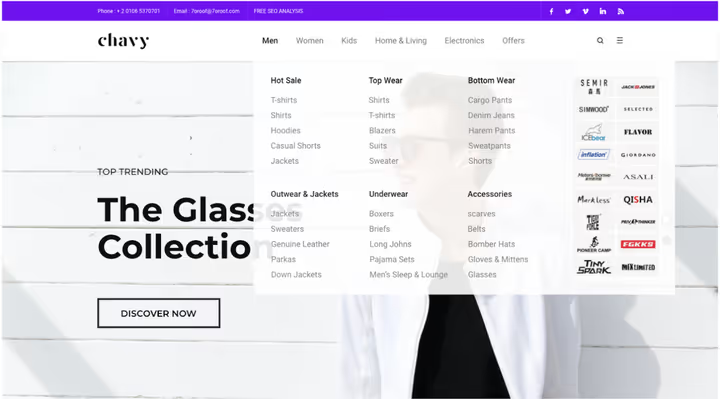
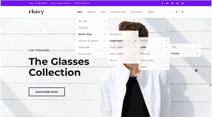
This is a colossal step forward compared to the "old" approach, composite menus with cascading submenus, where a visitor required sniper precision in movements, and one mistake returned them to the beginning:
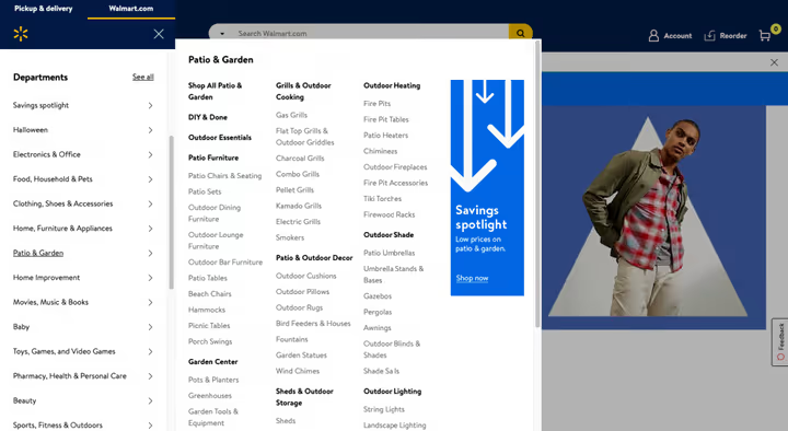
Here's how major online stores use mega menus:
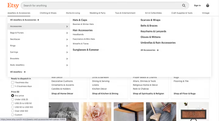
Etsy has a similar approach: handmade, vintage and supplies categories are expanded in one panel, the buyer sees the entire range at once:
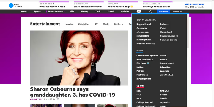
But mega menus are not only for e-commerce. News sites, magazines, content publishers, corporate portals, anywhere you need to make a mass of mid and lower-level information accessible, this technique works:
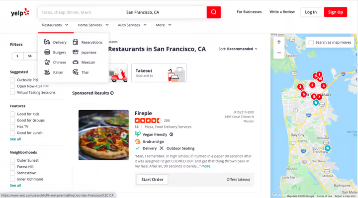
Yelp groups restaurants, home services and auto services into intuitive blocks, saving visitors time searching:
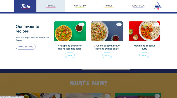
Website builder Tilda uses a mega menu to display template types and portfolio examples, helping new users orient themselves:
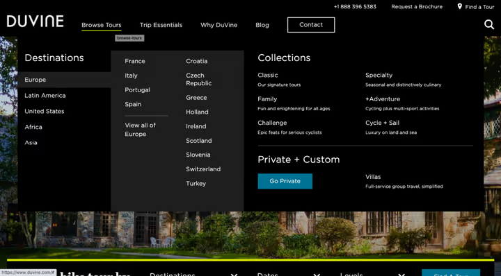
Travel site Duvine presents travel destinations in a clear grid, eliminating the need to scroll through a catalog:
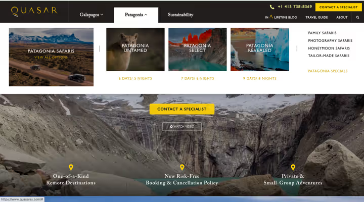
Quasar agency places portfolio, services and contacts in a mega menu, turning navigation into a showcase of capabilities:
What you'll need to create a mega menu
Elementor provides a visual editor with drag and drop and all design capabilities for building a mega menu. But to add the functionality itself, hover expansion, positioning, responsive switching, you need a third-party plugin.
Specifically, The Plus Addons for Elementor. This is a powerful extension with 120+ widgets, and among them, the TP Navigation Menu widget, which covers all scenarios: horizontal, vertical and sidebar mega menus, toggles, responsive options.
What The Plus Addons provides:
- Full Elementor integration. The widget is written specifically for Elementor and is compatible with all other widgets and builder features, no need to learn a new interface.
- Pixel-perfect responsiveness. You can set different menus or even different mega menu templates for desktop and mobile devices.
- Cross-browser support. All visitors get an equally quality experience regardless of browser.
- Flexible customization. Settings for size, alignment, label colors, icons, all through the familiar Elementor panel.
For full header functionality, you'll also need Elementor Pro, its Theme Builder allows you to create a custom header template and place the Navigation Menu widget in it.
How to create a mega menu in Elementor: step-by-step guide
The entire process fits into five steps. Make sure three plugins are installed and activated:
- Elementor (free)
- Elementor Pro version, for Theme Builder and custom headers
- The Plus Addons for Elementor, the free version is available on WordPress.org, but for the Navigation Menu widget you need a Pro license from the official site
Step 1. Activate the TP Navigation Menu widget
In the WordPress admin panel, go to ThePlus Settings → Plus Widgets and enable the TP Navigation Menu widget:
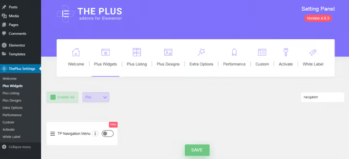
After activation, a new custom post type Plus Mega Menu appears in the admin panel sidebar, this is storage for all your mega menu templates.
Step 2. Create a mega menu template in Elementor
Go to Plus Mega Menu → Add New. Give the template a meaningful name, this will come in handy when you use different mega menus in different places on the site. Click Edit with Elementor:
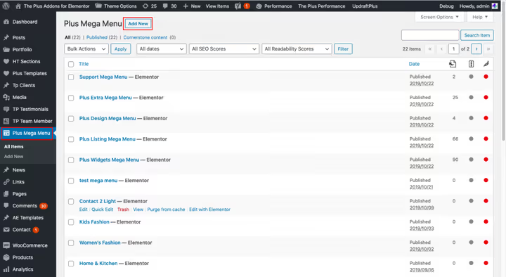
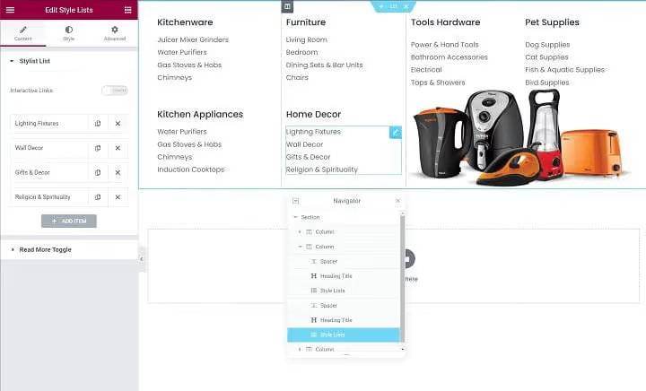
Now you're in Elementor's visual editor. Build the mega menu layout like a regular page: parent section spanning the full width of the mega menu, inside, columns for each semantic block, and in the columns, any Elementor widgets: headings, lists, images, buttons. Elementor Navigator (structure panel at bottom left) helps visualize the hierarchy of sections and columns.
When the design is ready, save and publish the template.
Step 3. Configure WordPress navigation menu
Now you need to link the created template to the actual site menu. Go to Appearance → Menus. If there's no menu yet, create one.
First, add regular top-level items for key sections through Custom Links, these are items that do not expand a mega menu, but simply lead to pages.
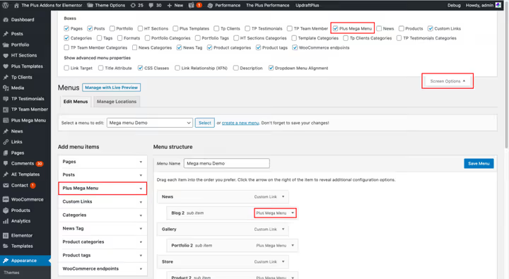
Then expand the Plus Mega Menu section in the add elements sidebar and select the template created in the previous step, it will be added as a menu item, hovering over which will expand the mega menu.
If the Plus Mega Menu section doesn't display, WordPress is hiding it. Click Screen Options in the top right corner and check the Plus Mega Menu checkbox:
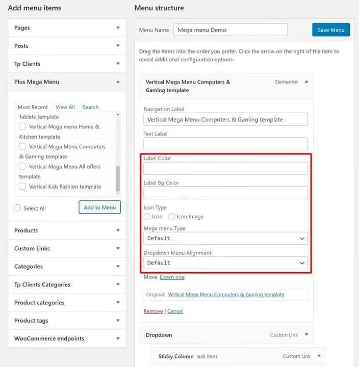
For the added item, configure size and alignment. Three size options are available:
- Default, maximum width in pixels.
- Container, by the site container width.
- Full Width, mega menu stretches to full screen width.
Here you also configure the element label, label colors and icons:
Step 4. Create a header template in Theme Builder
Now the mega menu needs to be placed in the site header. For this, Theme Builder is used, part of Elementor Pro.
Go to Templates → Theme Builder and create a new header template (or edit an existing one). You can choose a ready-made header template or build your own from scratch. Through Elementor Pro display conditions, configure where to show this header, across the entire site or only on specific pages.
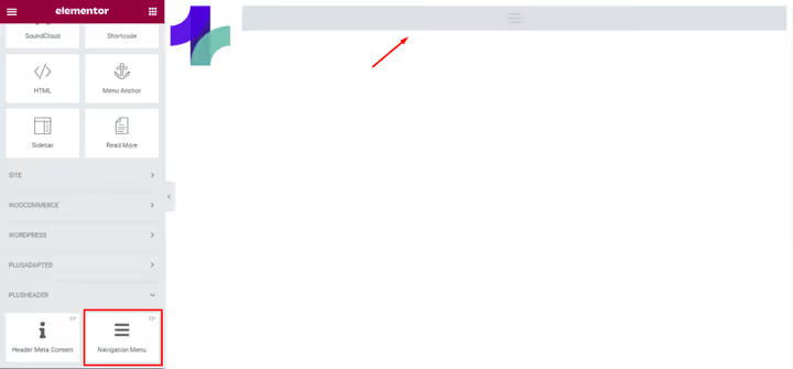
In the header editor, add the TP Navigation Menu widget from The Plus Addons:
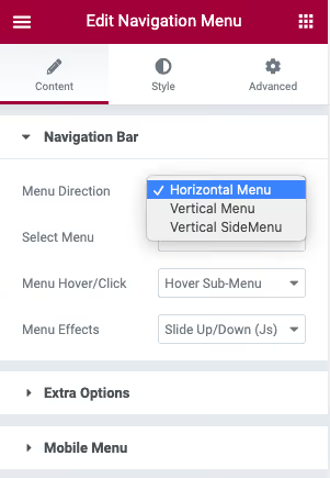
In the widget settings, select the menu direction, horizontal, vertical or vertical sidebar:
Then in the Select Menu option, specify the menu you configured in step 3:
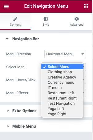
Additional styling parameters are available on the Style tab, colors, fonts, spacing, hover effects.
Step 5. Configure responsive behavior
The final step, mobile version. Expand the Mobile Menu settings on the Content tab of the Navigation Menu widget. Enable the Responsive Mobile Menu option and set the breakpoint, the screen width at which mobile layout activates:
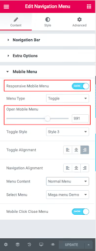
In the Menu Content dropdown, select what to show mobile visitors: the same menu as on desktop, a separate menu without mega menu (created in Appearance → Menus) or a completely separate template built in Elementor.
Done. You've just created a responsive mega menu on WordPress using Elementor and The Plus Addons.
Video: setup process firsthand
Theory is good, but a live demonstration saves half an hour of trial and error. This video shows the complete setup process for the Navigation Menu widget from The Plus Addons for Elementor, from activation to a working mega menu on the site:
⁉️🤔 Frequently asked questions
Is Elementor Pro needed to create a mega menu?
Yes, Elementor Pro is necessary. The free version of Elementor doesn't include Theme Builder, the tool for creating custom header templates, without which you can't place a mega menu widget in the site header. Standard WordPress themes don't provide an area for inserting an Elementor widget into navigation. Elementor Pro license starts at $59 per year for one site.
Is The Plus Addons free or paid?
The Plus Addons has a free version on WordPress.org with a basic set of widgets. However, the TP Navigation Menu widget, responsible for mega menus, is only available in the Pro version. A Pro license is purchased on the official theplusaddons.com website and includes 120+ widgets, 1000+ templates and priority support. An alternative path, Elementor Pro's built-in mega menu (appeared in version 3.12+), but it's inferior in flexibility: no sidebar and vertical mega menu, fewer responsiveness settings.
Can you create multiple different mega menus on one site?
Yes. The Plus Addons allows you to create any number of mega menu templates through Plus Mega Menu → Add New. Each template is built in Elementor independently. In WordPress menus (Appearance → Menus) you add the needed templates as separate items, for example, "Catalog" mega menu for the "Products" item and "Services" mega menu for the "Services" item. Through Elementor Pro display conditions, you can show different headers on different site pages: one header for the shop, another for the blog.
What to do if the mega menu doesn't display on mobile?
Check three settings in the Navigation Menu widget. First, is the Responsive Mobile Menu option enabled (Content tab → Mobile Menu). Second, is the breakpoint set correctly (width in pixels at which mobile layout activates). Third, is a specific source selected in Menu Content: if it's set to "Same as desktop", but the desktop menu is too wide for mobile screen, it won't fit. Solution: create a separate simplified menu for mobile in Appearance → Menus and select it in the Menu Content dropdown.
Does The Plus Addons conflict with other Elementor plugins?
Extremely rarely. The Plus Addons is written specifically for Elementor and is tested for compatibility with each major update. In May 2026, the plugin received WordPress 7.0 compatibility two days after release, this shows the level of support. If a conflict still occurs, start by disabling other Elementor addons one by one to find the culprit. Most often, problems are created not by main plugins, but by obscure extensions with untested CSS.
Create a mega menu that works for you
A mega menu is not decoration, but a navigation tool that turns chaos from thirty pages into an understandable structure. A visitor sees everything at once, reaches the needed section with one click and doesn't leave the site from frustration.
With Elementor and The Plus Addons, you get visual control over every pixel of the mega menu without a single line of code. The five steps described above, activation, template, menu, header, responsive, cover the entire cycle from idea to working solution in an hour to an hour and a half.
Choose the tool for the task. If the site is simple and the budget is limited, Elementor Pro's built-in mega menu is enough. If the project is complex, with several types of mega menus, different mobile and desktop navigation, install The Plus Addons and don't look back.

A professional team of writers and editors specializing in creating quality content.