














🚀 Lazy loading background images in Elementor: 2026 guide
Page load speed is not just about image compression and caching. Sometimes all <img> tags on a site are already lazy-loaded with loading="lazy", but PageSpeed Insights still complains about background images in Elementor sections. That's because background-image in CSS doesn't support lazy loading out of the box, the browser faithfully fetches every background image when parsing styles, even if the section is far below the fold.
This particularly hurts long landing pages: the first screen could render in 1.2 seconds, but it takes 4 seconds because the browser downloads 8 background images from the footer that the user won't scroll to for another minute. There is a solution, and over the past couple of years, options have emerged for any skill level, from "check a box" to custom JavaScript.
💡 Quick overview:
- Enable built-in background lazy loading in Elementor settings.
- Configure IntersectionObserver API for custom CSS backgrounds and older plugin versions.
- Apply jQuery with data attributes for sites where this framework is already in use.
Built-in lazy loading in Elementor
Since version 3.9, Elementor added an experimental Lazy Load Background Images feature, and by version 3.15+ it became stable and enabled by default on new installations. Under the hood, it's the same IntersectionObserver API as native browser solutions, but wrapped in a convenient toggle.
How to enable: go to Elementor → Settings → Features (or Settings → Experiments in the Russian interface), find the Lazy Load Background Images row and switch the toggle to Active. Save changes, and all background images of sections, containers, and columns set through the standard Elementor interface will start loading only when the user scrolls to them.
What this method does NOT cover: custom backgrounds written manually through the Elementor CSS tab (selector { background-image: url(...); }), and backgrounds added through third-party widget plugins. For those, use the methods below.
Pros: zero code, maintained by the Elementor team, automatically compatible with caching plugins. Cons: only for standard Elementor backgrounds, requires version 3.9+.

Separately, it's worth mentioning the background image format. Google PageSpeed Insights penalizes backgrounds in JPEG when there's WebP or AVIF available, and this penalty is independent of which method you used to defer loading. Convert all background images to WebP (quality loss is invisible to the eye, and file size is 25-35% smaller than JPEG) or AVIF (50% smaller than JPEG, but requires a fallback <picture> for Safari older than 16.0). Plugins like Converter for Media or Imagify do this automatically when uploading to the media library, including backgrounds uploaded through the Elementor interface.
IntersectionObserver: modern JavaScript without jQuery
If your Elementor version is below 3.9, or backgrounds are set with custom CSS, or you simply want full control, the IntersectionObserver API solves the task cleanly without overhead from scroll events.
Why not a scroll handler? The scroll event fires dozens of times per second and performs position calculations for elements in the main thread on every tick. Even with throttle, this is noticeable on weak devices. IntersectionObserver works asynchronously in the browser's compositor thread, it simply reports when an element has crossed the visibility threshold, without constant calculations.
Step 1. Markup and CSS. Add the CSS class lazy-bg-section to sections that need lazy loading:
1 .lazy-bg-section { 2 background-color: #f0f0f0; /* placeholder until background loads */ 3 background-repeat: no-repeat; 4 background-position: center; 5 background-size: cover; 6 } 7 8 .lazy-bg-section.loaded { 9 background-color: transparent; 10 }
The background color #f0f0f0 acts as a visual placeholder, the section doesn't look empty while the user scrolls. The .loaded class will be added from JavaScript when the section enters the viewport.
Step 2. JavaScript, initializing Observer. Place the code in your theme's script file or through a plugin like Code Snippets:
1 document.addEventListener('DOMContentLoaded', () => { 2 const sections = document.querySelectorAll('.lazy-bg-section'); 3 4 if (!sections.length || !('IntersectionObserver' in window)) return; 5 6 const observer = new IntersectionObserver( 7 (entries) => { 8 entries.forEach((entry) => { 9 if (entry.isIntersecting) { 10 const bgUrl = entry.target.dataset.bg; 11 if (bgUrl) { 12 entry.target.style.backgroundImage = `url(${bgUrl})`; 13 } 14 entry.target.classList.add('loaded'); 15 observer.unobserve(entry.target); 16 } 17 }); 18 }, 19 { rootMargin: '200px 0px' } 20 ); 21 22 sections.forEach((section) => observer.observe(section)); 23 });
Key detail: rootMargin: '200px 0px' means the Observer fires 200 pixels before the section actually appears on screen. The user doesn't see the loading moment, the image is already in place.
Step 3. Markup in Elementor. Open the needed section → Advanced tab → CSS Classes field, enter lazy-bg-section. In the same place, in Custom Attributes, add a data-bg attribute with the value as the full URL of the background image.
This approach works in any modern browser (Chrome 51+, Firefox 55+, Safari 12.1+, Edge 15+), that is, everywhere since 2016. For Internet Explorer, you'll need a polyfill, but such projects are now rare.
jQuery and data attributes: the classic approach
On really old sites where jQuery is already loaded on every page and rewriting the stack isn't an option, a method with data attributes and a scroll handler works. It's less performant than IntersectionObserver, but proven over years and doesn't require modern browser APIs.
Step 1. Section class. In Elementor section settings, Advanced tab → CSS Classes, specify lazy-background:
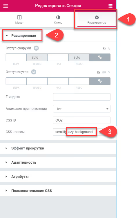
Step 2. CSS styles for background. To make the background image stretch correctly across the entire section after loading, set styles. In Elementor, this is done through the Advanced → Custom CSS tab of the specific section:
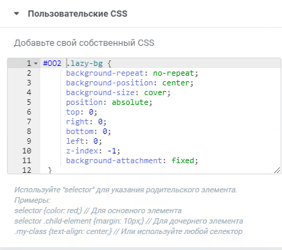
Basic styles for a full-screen background:
1 #OO2 .lazy-bg { 2 background-repeat: no-repeat; 3 background-position: center; 4 background-size: cover; 5 position: absolute; 6 top: 0; 7 right: 0; 8 bottom: 0; 9 left: 0; 10 z-index: -1; 11 background-attachment: fixed; 12 }
Note the selector #OO2, this is the section's CSS identifier that you set in the same Advanced → CSS ID tab. For each section with its own background, the identifier must be unique so styles don't overlap.
Option for small images (not full section). If you need to place a small image in the section rather than a full-screen background, for example a logo or decorative element in the footer, adjust styles for the specific size and position:
1 section#SDStudio-Footer .lazy-bg { 2 background-repeat: no-repeat; 3 background-position: right bottom; 4 background-size: 350px; 5 position: absolute; 6 top: 0; 7 right: 0; 8 bottom: 0; 9 left: 0; 10 z-index: 0; 11 background-attachment: fixed; 12 } 13 14 section#SDStudio-Footer .elementor-column.elementor-col-25, 15 .elementor-column[data-col="25"] { 16 width: 25%; 17 z-index: 2; 18 }
Here the background is positioned in the bottom right corner of the footer section with a fixed width of 350px, and columns are given z-index: 2 so content isn't covered by the background layer.
Step 3. Responsive images. To avoid loading a 2-megabyte image on a mobile screen with 400px width, prepare 6 image variants for different resolutions:
File | Screen width |
|---|---|
Background-min-width-1701px.jpg | from 1701px |
Background-max-width-1700px.jpg | up to 1700px |
Background-max-width-1200px.jpg | up to 1200px |
Background-max-width-1024px.jpg | up to 1024px |
Background-max-width-768px.jpg | up to 768px |
Background-max-width-400px.jpg | up to 400px |
Step 4. Data attributes. Upload images to the WordPress media library and specify paths to them in section data attributes. In Elementor: Advanced → Custom Attributes:
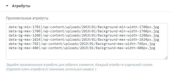
Format for each attribute:
1 data-bg-min-1701 | /wp-content/uploads/2020/03/Background-min-width-1701px.jpg 2 data-bg-max-1700 | /wp-content/uploads/2020/03/Background-max-width-1700px.jpg 3 data-bg-max-1200 | /wp-content/uploads/2020/03/Background-max-width-1200px.jpg 4 data-bg-max-1024 | /wp-content/uploads/2020/03/Background-max-width-1024px.jpg 5 data-bg-max-768 | /wp-content/uploads/2020/03/Background-max-width-768px.jpg 6 data-bg-max-400 | /wp-content/uploads/2020/03/Background-max-width-400px.jpg
The script (see below) reads these attributes, determines the current screen width through window.matchMedia and inserts the URL of the needed size.
Step 5. jQuery script. Add the code to your theme's script file or through a plugin:
1 jQuery(document).ready(function ($) { 2 var $window = $(window), 3 lazyBgArr = []; 4 5 $window.on('load resize scroll', function () { 6 for (var i = 0; i < lazyBgArr.length; i++) { 7 var func = lazyBgArr[i]; 8 if (func !== undefined) { 9 func(); 10 } 11 } 12 }); 13 14 function lazyBg(strEl, intPos) { 15 return function () { 16 var intCheckVal = $window.scrollTop() + $window.height() + 100; 17 if (intCheckVal > strEl.offset().top) { 18 var data_bg; 19 20 if (window.matchMedia('(min-width: 1701px)').matches) { 21 data_bg = 'data-bg-min-1701'; 22 } else if ( 23 window.matchMedia('(min-width: 1201px) and (max-width: 1700px)').matches 24 ) { 25 data_bg = 'data-bg-max-1700'; 26 } else if ( 27 window.matchMedia('(min-width: 1025px) and (max-width: 1200px)').matches 28 ) { 29 data_bg = 'data-bg-max-1200'; 30 } else if ( 31 window.matchMedia('(min-width: 769px) and (max-width: 1024px)').matches 32 ) { 33 data_bg = 'data-bg-max-1024'; 34 } else if ( 35 window.matchMedia('(min-width: 401px) and (max-width: 768px)').matches 36 ) { 37 data_bg = 'data-bg-max-768'; 38 } else if (window.matchMedia('(max-width: 400px)').matches) { 39 data_bg = 'data-bg-max-400'; 40 } 41 42 if (!data_bg) return; 43 44 var tmpImg = new Image(), 45 strSrc = strEl.attr(data_bg); 46 tmpImg.src = strSrc; 47 delete lazyBgArr[intPos]; 48 49 $(tmpImg).on('load', function () { 50 strEl.append('<div class="lazy-bg"></div>').css('opacity', 1); 51 strEl.addClass('loaded'); 52 }); 53 } 54 }; 55 } 56 57 $('.lazy-background').each(function (i) { 58 lazyBgArr.push(lazyBg($(this), i)); 59 }); 60 });
How it works: on page load and every scroll event, the script checks the position of each section with the .lazy-background class. If the section enters the "screen + 100px buffer" zone, the current viewport width is determined through matchMedia, the needed data attribute is selected, a temporary Image object is created for preloading, and after successful loading, a <div class="lazy-bg"> with the background image is added to the section. The processed section is removed from the watch array, there are no repeated loads.
Which method to choose: comparison
Criterion | Built-in (Elementor 3.9+) | IntersectionObserver | jQuery + data attributes |
|---|---|---|---|
Code needed | No | Yes, ~20 lines JS | Yes, ~60 lines JS |
Performance | High (compositor) | High (compositor) | Medium (main thread) |
Background coverage | Only standard Elementor | Any CSS backgrounds | Any CSS backgrounds |
Browsers | Chrome 51+, Firefox 55+, Safari 12.1+, Edge 15+ | Chrome 51+, Firefox 55+, Safari 12.1+, Edge 15+ | All, including IE9 |
Responsive images | No | In development (manual) | Yes, via matchMedia |
Maintenance complexity | Zero (Elementor team) | Low | Medium (scroll handler) |
The practical selection criterion is simple: if your Elementor is version 3.9 or newer and backgrounds are set in the standard way, enable the built-in feature and close the issue. If backgrounds are custom (CSS tab, third-party widgets), use IntersectionObserver in vanilla JavaScript, without jQuery. Leave the jQuery method for projects where jQuery is already present and there's no budget for rewriting, or where Internet Explorer support is needed.
Regardless of the chosen method, the background image physically remains the same file on the server. If it weighs 800 kilobytes, lazy loading won't make it lighter, it will just postpone the moment when the browser starts downloading those 800 kilobytes. That's why the rule "optimize first, lazy load second" applies here too: first compress to WebP or AVIF and resize to the maximum screen width of the target audience, and only then apply any of the three lazy loading methods. Caching plugins (WP Rocket, LiteSpeed Cache, Flying Press) don't conflict with any of the three approaches, since a background loaded through CSS background-image is cached by the browser the same way as a regular <img>.
⁉️🤔 Frequently asked questions
Why not just use loading="lazy" for background images?
The
loading="lazy"attribute only works with<img>and<iframe>tags, but not with the CSSbackground-imageproperty. The browser doesn't know that your CSS contains an image URL that could be deferred until it parses the stylesheet, and by that point the request has already gone to the network. That's exactly why backgrounds need a separate mechanism.
Which method should I choose if the site is 3 years old and Elementor is version 3.12?
Built-in lazy loading from Elementor. Version 3.12 already includes this feature in stable status, just go to Settings, Features and enable it. No code writing needed.
Does the jQuery method slow down significantly on mobile?
On budget Android devices from 2019-2020, noticeably. The
scrollevent combined withoffset().tophits the main thread on every frame of scrolling. If the site's audience is predominantly mobile, switch to IntersectionObserver or update Elementor to 3.9+ and enable the built-in feature.
Can I combine approaches on one site?
Yes, and it's normal practice. Most background sections configured through the standard Elementor interface are handled by built-in lazy loading. The remaining custom sections with manual CSS you attach to IntersectionObserver. There's no conflict: Observer only fires on elements with the specified class, and Elementor's built-in mechanism ignores them.
Is it mandatory to prepare 6 image sizes, or is one enough?
Six sizes is the maximum for meaningful detail. In practice, for most sites, three are enough: 1920px for desktop, 1024px for tablet, and 768px for mobile. Four breakpoints, adding 400px for small screens, is already a good balance between quality and effort. One image for all resolutions works, but loads extra kilobytes on mobile, Google PageSpeed Insights will notice this.
Is it worth bothering with custom code in 2026?
If you have Elementor 3.9 or newer, almost certainly not. The built-in feature covers the needs of the vast majority of sites: enable it, check in PageSpeed Insights, forget about it. Custom methods (IntersectionObserver and especially jQuery) are justified in exactly two cases: the Elementor version is frozen below 3.9 for a valid reason, or backgrounds are added in a non-standard way and the standard toggle doesn't see them.
For a new project on fresh Elementor, the correct order of actions is: enable built-in lazy loading, run the site through PageSpeed Insights, and only if specific background images are still flagged as problematic, deal with them individually through IntersectionObserver. Don't write custom code in advance "just in case", every extra line of JavaScript that you can avoid writing saves you maintenance time.

A professional team of writers and editors specializing in creating quality content.