













 AIIllustrative image: AI-generated
📋 Contact Form 7 in 2 or more columns: flexbox and shortcode approach
The standard Contact Form 7 layout is a vertical column of fields. Name, email, subject, message, stacked one below another, stretched to full width. It looks clunky and takes up screen space, especially when you have more than three fields.
But here's the thing: the CF7 editor understands HTML. This means you can wrap fields in div containers, set their width, and align them in a row. No plugins, no hacks, just pure CSS.
Below are two working methods to arrange Contact Form 7 fields into 2, 3, or 4 columns. The first is universal (HTML + CSS), the second uses your theme's shortcode system. Both have been tested on live sites and don't break mobile layouts.
💡 Quick overview:
- See what a default CF7 form looks like and why vertical layout is problematic
- Copy the ready-made CSS flexbox and paste it into your child theme (method 1, no plugins)
- If your theme already supports column shortcodes, enable them in CF7 and wrap your fields (method 2)
- Test the result on desktop and mobile (media query included)
What a default Contact Form 7 form looks like
After creating a form through "Contact" → "Add New", you get standard markup: text fields, email, message, and a submit button, strictly stacked one below another. In the editor it looks like this:
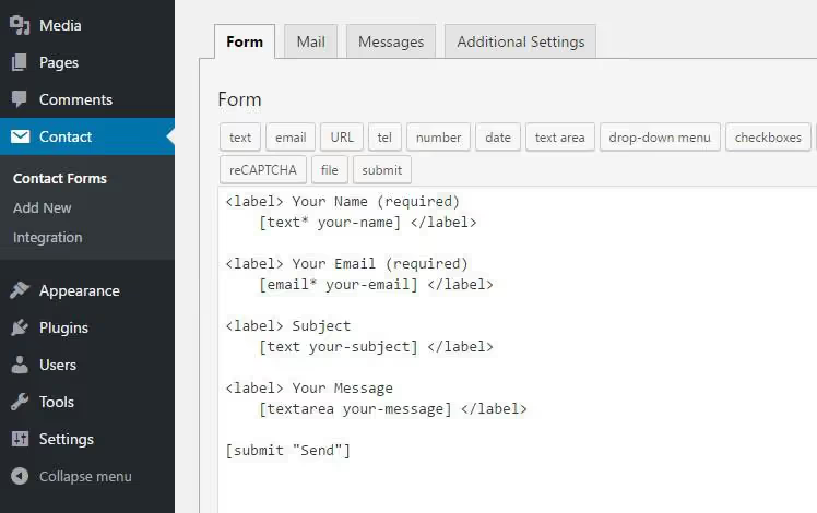
On the frontend, with TwentySeventeen or any other theme without custom form styling, the output will be vertical:
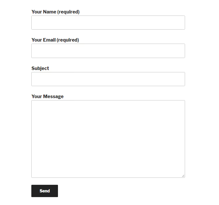
The "Name" and "Email" fields take up the entire available width, even though half would be enough for each. The result: the form looks bulky, users scroll more than necessary, and conversions drop.
The CF7 editor is designed to accept HTML markup inside the form template. That's exactly what we'll use.
Method 1: HTML + CSS flexbox (recommended)
The approach: wrap form fields in <div> elements with CSS column classes, then define those classes once in your child theme or through a custom CSS plugin.
No additional column plugins needed, just CF7 and a few lines of CSS.
CSS grid for 2 and 3 columns
Below is ready-to-use CSS with flexbox. Unlike float-based solutions, flex automatically aligns columns by height and doesn't require clearfix hacks:
1 /* Column row */ 2 .cf7-row { 3 display: flex; 4 flex-wrap: wrap; 5 gap: 4%; 6 margin-bottom: 16px; 7 } 8 9 /* 2 columns */ 10 .cf7-col-2 { 11 flex: 0 0 48%; 12 } 13 14 /* 3 columns */ 15 .cf7-col-3 { 16 flex: 0 0 30.66%; 17 } 18 19 /* Mobile: columns stack vertically */ 20 @media only screen and (max-width: 767px) { 21 .cf7-col-2, 22 .cf7-col-3 { 23 flex: 0 0 100%; 24 } 25 }
Place the CSS in your child theme (style.css file) or through the Simple Custom CSS plugin, which adds a styles field in the admin panel without editing files.
Markup inside CF7
Open the form editor (Contact → your form) and wrap fields in div containers with the CSS classes from above. For 2 columns:
1 <div class="cf7-row"> 2 <div class="cf7-col-2"> 3 <label>Your name (required) 4 [text* your-name] 5 </label> 6 </div> 7 <div class="cf7-col-2"> 8 <label>Your Email (required) 9 [email* your-email] 10 </label> 11 </div> 12 </div> 13 14 <label>Your message 15 [textarea your-message] 16 </label> 17 18 [submit "Send"]
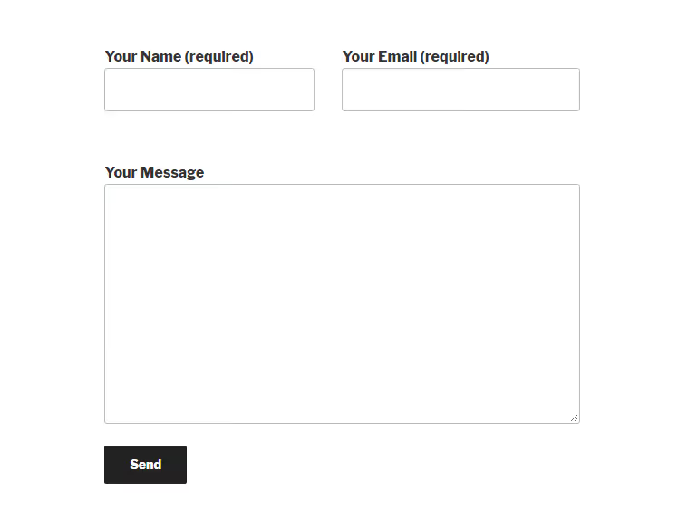
On the site, the result will look like this:
Three columns, same logic
For three fields in a row, change the classes to cf7-col-3 and add a third block:
1 <div class="cf7-row"> 2 <div class="cf7-col-3"> 3 <label>Your name (required) 4 [text* your-name] 5 </label> 6 </div> 7 <div class="cf7-col-3"> 8 <label>Your Email (required) 9 [email* your-email] 10 </label> 11 </div> 12 <div class="cf7-col-3"> 13 <label>Subject 14 [text your-subject] 15 </label> 16 </div> 17 </div> 18 19 <label>Your message 20 [textarea your-message] 21 </label> 22 23 [submit "Send"]
Frontend output:
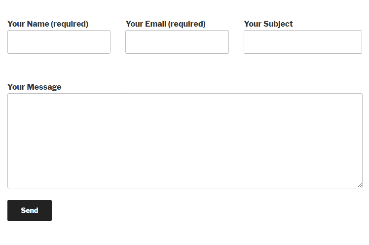
The "Name", "Email", and "Subject" fields are now aligned in a single row, while the message spans the full width below them. On screens narrower than 767px, all columns collapse into one, keeping the form readable on phones.
The flexbox advantage: if field heights differ (for example, a long label in one column), the row doesn't break. Flex aligns columns automatically. Float-based layouts can't do this without clearfix and margin-right workarounds.
Method 2: theme shortcode columns
Some WordPress themes, especially commercial ones like GeneratePress, Kadence, and Astra, come with a built-in shortcode system for columns. This typically appears as a button in the editor that generates shortcodes like [one_half]...[/one_half] or [column grid="6"]...[/column].
If your theme supports this, CF7 columns can be created without CSS. However, you need to allow CF7 to process shortcodes inside the form, since it ignores them by default.
Step 1: enable shortcodes in the CF7 editor
Install the Contact Form 7 Shortcode Enabler plugin. It's minimal, weighs a few kilobytes, and does exactly one thing: passes shortcodes through CF7.
Alternative without a plugin: add a filter to your child theme's functions.php:
1 add_filter('wpcf7_form_elements', 'cf7_do_shortcode'); 2 3 function cf7_do_shortcode($form) { 4 return do_shortcode($form); 5 }
Step 2: wrap fields with column shortcodes
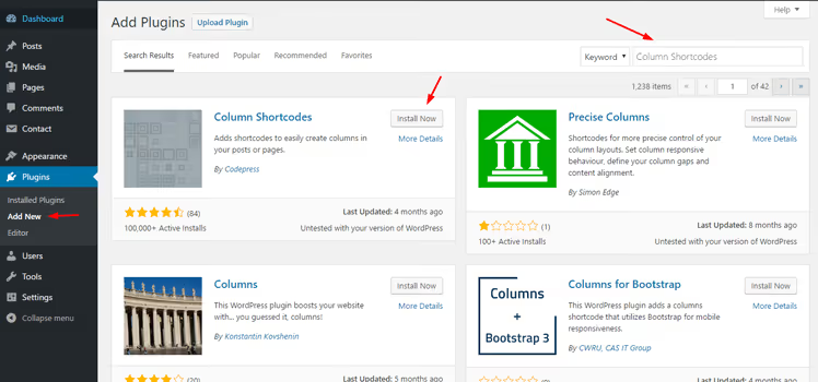
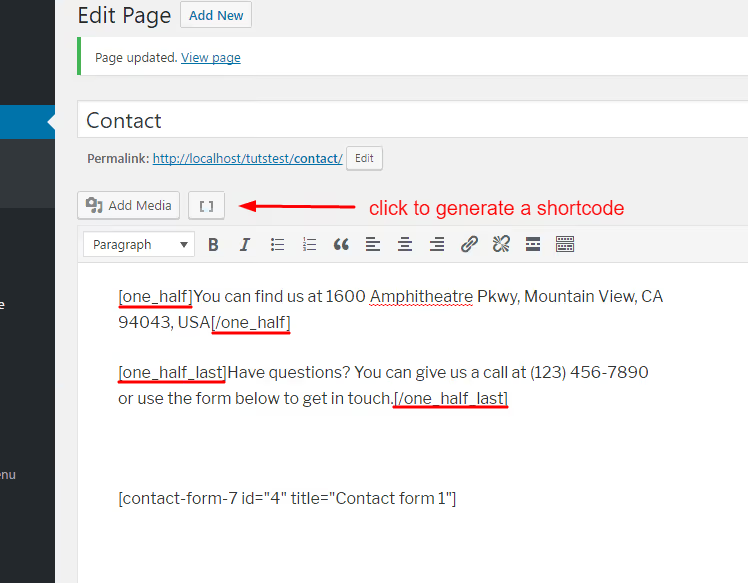
The principle is the same as with div classes, but instead of CSS classes you use theme shortcodes. The generation button is usually found in the WordPress visual editor:
Generate shortcodes for the desired number of columns and insert content:
Page output:

Now transfer the shortcodes to the CF7 editor. For 2 fields in a row:
1 [one_half] 2 <label>Your name (required) 3 [text* your-name] 4 </label> 5 [/one_half] 6 7 [one_half_last] 8 <label>Your Email (required) 9 [email* your-email] 10 </label> 11 [/one_half_last] 12 13 <label>Your message 14 [textarea your-message] 15 </label> 16 17 [submit "Send"]
The frontend result is the same two columns as in method 1. This approach is convenient when your theme already has shortcodes for grids: no CSS needed, and responsiveness works out of the box.
The downside: you're tied to your theme. Switch themes, and the shortcode columns disappear, breaking your form. Method 1 with CSS transfers between any theme.
Video: step-by-step multi-column form setup
A detailed video walkthrough in English where the author demonstrates both approaches, including flexbox setup and mobile adaptation:
⁉️🤔 Frequently asked questions
Does flexbox markup work in older browsers?
Flexbox has been supported by all modern browsers for over ten years: Chrome, Firefox, Safari, and Edge have full compatibility without prefixes starting from versions released in 2015-2016. The only exception is Internet Explorer 11, where flexbox works with minor bugs and requires the
-ms-prefix, but IE11's share of global traffic has dropped below statistical significance. For production sites, flexbox is safe to use without prefixes.
Can I have different numbers of columns in different form rows?
Yes. The flexbox container
.cf7-rowisolates each row: it can contain 2, 3, or 4 columns, while the next row has a different combination. For example, the first row has name + email (2 columns), the second has company + phone + city (3 columns), and the third has a message spanning full width. Just make sure to close one.cf7-rowbefore opening the next.
What if field labels have different lengths and columns shift?
In a flexbox row, columns stretch to the height of the tallest one by default. This is explicitly enabled with
align-items: stretch(active by default in the code above). If labels still appear misaligned visually, set a fixed label height withlabel { min-height: 48px; display: block; }inside the form.
Do I need to enable shortcodes for method 1 with CSS?
No. Method 1 uses pure HTML (div containers with classes), and CF7 passes HTML markup through without additional plugins. The Shortcode Enabler plugin is only needed for method 2, where theme shortcode columns are used inside the form.
What if my theme uses Gutenberg instead of shortcodes?
Gutenberg columns work at the page/post level, but not inside the CF7 editor. The CF7 form itself is inserted via the
[contact-form-7 id="..." title="..."]shortcode on a page, and Gutenberg doesn't control field layout inside it. For columns inside the form, use method 1 (CSS flexbox), which is compatible with any editor.
Is it worth the effort to set up columns?
A single-column form works. A two-column form works and collects more submissions because it looks neater and requires less scrolling. The conversion difference may seem trivial at first glance, but over time it adds up to dozens of leads.
The flexbox method fully solves the problem: 15 lines of CSS, 5 minutes of setup, zero plugins. It's not tied to any theme, doesn't break when the CMS updates, and doesn't create dependencies. If your theme already supports dividing content into columns, the shortcode approach also works, just remember the shortcode enabler plugin and that columns will disappear if you switch themes.
Both methods have been tested on CF7 version 6.1 and above, with WordPress 6.5+. They work in production without surprises.

A professional team of writers and editors specializing in creating quality content.