






How to use minimalism in WordPress web design
A website where the eye has nothing to catch onto fails. But a website where the eye catches onto EVERY pixel fails even more. When every plugin pulls its own font, every widget screams its own color, and banners blink from all corners, visitors leave. Not because the content is bad. Because the brain is tired of filtering noise.
Minimalism in web design solves exactly this problem. And WordPress, which powers more than 38% of websites, is the perfect platform for a minimalist approach. Thousands of themes, dozens of builders, flexible customization allow you to remove the excess and keep the essence.
But minimalism is not "make a white background and black text." It's a discipline: every button, every margin, every pixel is justified by a task. Below is not textbook theory, but applied principles you can implement on a live WordPress site today.
💡 Quick overview:
- Understand the essence of minimalism in web design and its difference from simply an "empty" site
- Apply nine techniques: negative space, hidden navigation, unified palette, minimal fonts
- Study four live examples of minimalist WordPress sites with design breakdowns
- Evaluate how minimalism affects business: retention, loading speed, conversion
What is minimalism in web design
Formally, minimalism came to the web from 1960s art, the Tate gallery describes it as "an extreme form of abstraction built on simple geometric shapes." But in the context of websites, it's not about Malevich's squares. It's about every element on the page carrying a purpose. No purpose, the element goes.
Researchers at Nielsen Norman Group formulate it more harshly: "In most minimalist interfaces, color is used strategically to attract attention without adding additional design elements or graphics." That is, minimalism is not "few elements." It's "elements work precisely on target."
On WordPress, minimalism is amplified by the CMS architecture itself. The modular theme and plugin system allows you to build a page from blocks where each block is justified. Gutenberg with its spacers, paddings, and column width control provides fine-tuning. Builders like Elementor or Bricks go even further.
But tools are only means. Below are the principles that turn a tool into a result.
9 principles of minimalist WordPress design

The set of practices below is not a "do everything at once" checklist. It's a menu: choose what will give the greatest effect for your specific site. Blog, portfolio, landing page, or store, the accents will be different.
1. Negative space
Emptiness between elements is not a layout error. It's oxygen for the eye. Generous margins direct the reader's attention to what really matters: the product, the headline, the button.
On WordPress, this is managed through paddings and margins of modules in any builder. Even Gutenberg has a "Spacer" block, primitive but functional. Advice: don't fear 80-120 px spacing between semantic blocks. On mobile, cut it in half.
2. Hidden navigation
A hamburger menu or off-canvas panel removes navigation from view until the moment it's needed. This works for conversion: the visitor isn't distracted by menu items until ready to navigate.
Most modern WordPress themes include this pattern out of the box. If yours doesn't, plugins like Max Mega Menu add off-canvas mode with a couple clicks.
3. Unified color scheme
A minimalist site lives in a palette of two to three colors: neutral background, contrasting text, one accent color for buttons and links. Monochrome with an accent is the most reliable option.
Live Theme Customizer in WordPress lets you select an accent color without code. Builders provide global color settings for all modules at once. The main rule: once you've chosen a palette, keep it consistent across all pages. Three different shades of "almost blue" on one site kill minimalism instantly.
4. Typography without noise
Two fonts for the entire site: one for headings, one for body text. That's it. A third only if it's the logo. Weight, line height, and contrast make the page readable without images and animation. Good typography creates hierarchy by itself, heading leads to subheading, subheading to paragraph.
Loading custom fonts on WordPress can be done through a plugin (for example, Fonts Plugin | Use Google Fonts) or manually through functions.php. But don't get carried away: every extra font is an additional HTTP request and slower loading.
5. Brevity in details
Every element on the page has exactly one task. A subscription form collects email. A product card leads to the cart. A menu icon designates a section. If an element does two things at once or none, it's unnecessary.
On WordPress, the temptation to overload a page is high: widgets, "related posts" blocks, counters, calendars. Disable everything the visitor can do without.
6. Intuitive navigation
A site is a map. The home page is the entry point. From it, the visitor should get to the needed section without hesitation. Breadcrumbs and logical menu structure ensure orientation.
Most SEO plugins (Yoast SEO, Rank Math) add breadcrumbs automatically. Themes usually support them out of the box. Check: if a visitor landed on an internal page from search, they should understand in a second where they are and how to get back to the top.
7. Responsiveness
Minimalist design adapts to mobile naturally, there are few elements, nothing to break. Modern WordPress themes are responsive by default. But check the mobile menu separately: the hamburger should be convenient for finger touch (recommended touch target size per WCAG standard is from 44 px), and line spacing should be sufficient for reading from a phone.
8. Visual harmony
All page elements, text, images, buttons, icons, should feel like parts of one whole. Common categories like color, shape, texture, and proportions create this cohesion.
On WordPress, visual harmony is achieved through global theme or builder settings. Total Theme with WPBakery, Divi with Divi Builder, GeneratePress with the block editor, all of them give control over margins, colors, and typography at the theme level, not individual pages.
9. Call to action
A CTA button in minimalist design is often the only bright element on the page. It should be noticeable, contrasting, and surrounded by sufficient white space. The text on the button is a verb: "Download," "Try," "Sign up."
Gutenberg includes a "Buttons" block, builders have ready-made CTA modules. Either way, verify that the button leads where it promises.
How minimalism affects business

Minimalism in design is not an aesthetic whim. It's a business tool with measurable effect:
Retention. When the eye doesn't need to filter noise, the visitor stays on the site longer. Fewer bounces → deeper views → higher chance of conversion.
Loading speed. Fewer elements = fewer HTTP requests = faster loading. Core Web Vitals from Google directly tie speed to ranking. A minimalist site wins on this metric automatically.
Product focus. If the site is a showcase, then minimalism removes everything from it except the product. The visitor sees the product, not sliders, pop-ups, and scrolling text.
Trust. An overloaded site is subconsciously perceived as cheap or spammy. Clean, thoughtful design signals: "we know what we're doing."
The connection between design and business results is direct: clear visual hierarchy → understandable user path → higher conversion. No need to take it on faith, A/B test it. Removed one block, measured bounces. Simplified the menu, measured view depth. WordPress plugins like Nelio AB Testing let you do this without a programmer.
Examples of minimalist WordPress sites
The four live sites below are built on WordPress. Each has its own approach to minimalism. They share one thing: the visitor understands from the first second where they landed and what to do next.
S'well
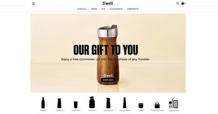
The S'well online store sells reusable bottles, and the site works as a premium showcase. Mega menu with preview images, hamburger on desktop, slider with bold typography and contrasting colors. Right below the slider, bottle shape icons to choose your own. Pixel-perfect iconography, typography, and modular grid, an example of how minimalism sells a physical product.
Toyota
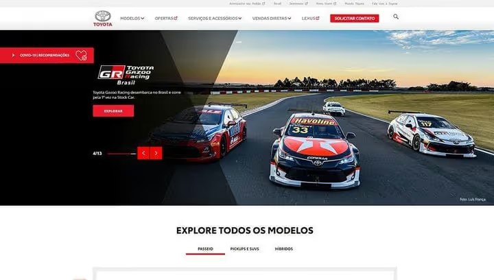
The Brazilian Toyota site is an example of presentational minimalism. Black, gray, and red on white background. Wide sliders, Helvetica, minimal navigation elements. The car itself is an object with expressive design, and the site doesn't interrupt it but presents it.
SparkPost

SparkPost is an email delivery service for developers. The site uses geometric shapes in orange and gray shades. The navigational mega menu directs visitors immediately to the needed category. The footer is information-rich but organized: social media, newsletter, section links, everything in its place.
Plesk
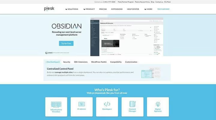
Plesk is a platform for managing hosting. From the first screen, everything is clear: lots of white space, light blue accents, mega menu with direct access to key sections. Flat icons, minimal text on the landing page, the user orients instantly.
More examples of WordPress sites with architecture breakdowns in our review of brands using WordPress.
⁉️🤔 Common questions
Is minimalism suitable for a WooCommerce online store?
Yes, and often works better than overloaded design. A product card with minimal distracting elements, large photos, and one CTA button converts higher than a page with five banners and a pop-up chat. The main thing is not to remove functionally necessary elements: filters, search, cart.
Is it mandatory to use a page builder?
No. Gutenberg covers basic needs: spacers, buttons, columns, margin management. A builder (Elementor, Bricks, Divi) gives finer control but pays for it with additional CSS and JavaScript. For a blog, Gutenberg is enough, for a landing page, a builder is justified.
How to choose a theme for a minimalist site?
Look at three things: number of options in Customizer (the less visual clutter, the better), speed (check the theme demo page through PageSpeed Insights), and Gutenberg support. Themes like GeneratePress, Kadence, Blocksy are specifically designed for minimalism and performance.
Won't minimalism make the site "empty" or "boring"?
Minimalism is not the absence of design but precision of design. Good typography, calibrated margins, one accent color, and quality images create enough character. "Boring" is when everything is gray and identical. "Minimalist" is when everything is in its place.
How to check if a site is overloaded?
Open any page and ask three questions about each visible element: why is it here? what should the visitor do upon seeing it? what happens if it's removed? If the answer to the third question is "nothing," remove it. Repeat once a quarter.
What works: minimalism as a system, not a style
Minimalist web design on WordPress is not an aesthetic choice and not a trend tribute. It's a design approach: every decision is justified by a task. Negative space directs the eye. Two fonts create hierarchy. One CTA button leads to the goal.
Try applying one principle out of nine today. For example, go through the site pages and ruthlessly delete everything that doesn't answer the question "why?". Then measure bounces in a week. Most likely, the numbers will speak for themselves.

A professional team of writers and editors specializing in creating quality content.