





 AIIllustrative image: AI-generated
🔤 Fira Code: a monospaced font with ligatures for programming
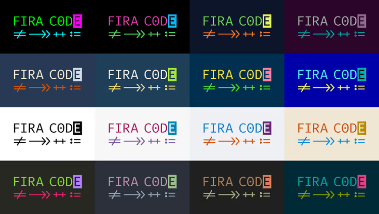
What ligatures are and why they matter in code
A ligature is the combination of two or three characters into a single visual glyph. In typography, this technique has been known for centuries: the letters "f" and "i" merge into fi to avoid colliding with each other. In programming, the same mechanism works with operators.
When you write != followed by => and >= or ===, your eye reads them as a single logical token. But on screen, these are two or three separate characters, and your brain expends micro-efforts to combine them. Over the course of a workday, these micro-operations add up to thousands. Ligatures solve the problem: != turns into a crossed-out equals sign (≠), => becomes a bold arrow, and >= looks like a unified "greater than or equal" symbol.
Developer Nikita Prokopov (tonsky) built an entire font around this idea. Fira Code is a free monospace family based on Fira Mono, extended with programming ligatures. Under the hood, it's pure ASCII: the source code doesn't change, rendering happens at the font level. The file stays the same but reads differently.
💡 Quick overview:
- Download Fira Code from the GitHub release: ZIP ~2.5 MB, version 6.2, free
- Install the font on your system and set
editor.fontFamilyandeditor.fontLigaturesin your editor - Choose stylistic sets and character variants to match your taste: from
ss01tocv31 - Check your editor's support in the official compatibility table on GitHub
How Fira Code changes code reading
The first thing that catches your eye after installation: comparison operators. Where there used to be != (exclamation mark + equals), there's now a unified crossed-out symbol. <= and >= look like mathematical signs from a textbook, not two separate ASCII characters.
Arrows are a separate kind of magic. Any chain of hyphens and angle brackets assembles into a continuous line. Try -->, <--, and <-->: they merge into a solid arrow. In Fira Code 4, the developer replaced 44 individual arrow ligatures with four combinatorial rules. Now arrows can be any length. Even ---> and <--- work.
Multi-character operators also assemble into unified glyphs: === and !==, :: and //, |||. Comments like <!-- --> look neater. For functional programming enthusiasts, there are |> and >>= with =<<, and dozens more.
Below is the same PHP code without Fira Code and with it. The difference isn't dramatic, but try to "spot the differences": your eye catches operators faster.
Without Fira Code
1 /** 2 * Arrows --> and -->> illustrate data flow. 3 */ 4 $out = array(''); 5 $pieces = array( 6 '<!-- HTML -->', 'https://www.example.com/#!', 'red', '##', 0x0, '' 7 ); 8 for ($i = 0; $i <= 5; $i++) { 9 if ($i == '2' || $pieces[$i] === 'red') { 10 $hex__red = 0xca0000; 11 $out[] = $hex__red >> 15; // 404 12 } elseif ($i !== 3 && $pieces[$i] != false) { 13 $out[] = $pieces[$i]; 14 } 15 } 16 echo implode('', $out);
With Fira Code
1 /** 2 * Arrows --> and -->> illustrate data flow. 3 */ 4 $out = array(''); 5 $pieces = array( 6 '<!-- HTML -->', 'https://www.example.com/#!', 'red', '##', 0x0, '' 7 ); 8 for ($i = 0; $i <= 5; $i++) { 9 if ($i == '2' || $pieces[$i] === 'red') { 10 $hex__red = 0xca0000; 11 $out[] = $hex__red >> 15; // 404 12 } elseif ($i !== 3 && $pieces[$i] != false) { 13 $out[] = $pieces[$i]; 14 } 15 } 16 echo implode('', $out);
Both blocks are identical character by character. Only the font differs. In the second case, <= and >= became unified signs, != and !== look crossed out, and --> turned into an arrow. Reading speeds up, not radically, but noticeably. Especially during long code review sessions.
Where Fira Code works
The font is supported by dozens of editors: from VS Code and Sublime Text to Vim and Emacs. The full list is available in the compatibility table on GitHub.
Key platforms:
VS Code: native support. In
settings.json, add"editor.fontFamily": "'Fira Code'", "editor.fontLigatures": true. Stylistic sets are enabled via"editor.fontLigatures": "'calt', 'ss02', 'ss09'".JetBrains IDE (IntelliJ, PhpStorm, WebStorm, Rider): since version 2016.2. Setup: Editor → Font → select Fira Code → enable Enable ligatures.
Sublime Text: starting from build 3146. In user settings:
"font_face": "Fira Code".Vim/Neovim: via
set guiligaturesin GUI versions and patches for terminal versions.Terminals: Windows Terminal, iTerm 2, Kitty, Konsole, Tabby, Hyper, WezTerm. Not supported: Alacritty, GNOME Terminal, xterm, PuTTY.
Browsers: via jsdelivr CDN. Include
<link rel="stylesheet" href="https://cdn.jsdelivr.net/npm/firacode@6.2.0/distr/fira_code.css">and addfont-feature-settings: "calt";for IE/legacy Edge.
In practice, installation looks like this: download the ZIP from the release, install the TTF on your system, set the font in your editor, enable ligatures. That's it. No plugins, no magic, just pure @font-face at the OS level.
Fine-tuning: variants and stylistic sets
The main advantage of Fira Code over competitors is flexibility. Don't like a specific ligature? Disable it. Want a different letter shape? Choose a character variant. Everything is customizable on a granular level.
Character variants (cv01-cv31) change the shape of individual characters:
cv01-cv10: alternative designs for lettersaandg, as well asiandlcv11-cv13: zero variants (with dot, without, slashed)cv14: alternative threecv15: asterisk aligned to the top (convenient for C/C++ pointers)cv31: alternative parentheses()
Stylistic sets (ss01-ss10) control ligatures:
ss01: alternative rendering of&&ss02:<=without slant, with horizontal barss03:&in typewriter styless04: dollar$without slashss05:@without curly tailss09: restores separate>>=/<<=/||=(removed from default in v6, details on GitHub)
Progress bars deserve special mention. Fira Code is the first programming font where characters U+EE00-U+EE0B render as a progress bar strip. The terminal outputs a sequence ``, and the user sees a nice fill. For detecting support, an environment variable UNICODE_PROGRESS_BAR=true has been proposed.
Alternatives: what to compare with
Fira Code isn't the only font with ligatures. The market has expanded in recent years, and each option has its own focus:
Font | License | Feature |
|---|---|---|
JetBrains Mono | SIL OFL | Enhanced readability, varied lowercase height, no rounding |
Cascadia Code | SIL OFL | Microsoft's font for Terminal, Powerline support, box drawing |
Iosevka | SIL OFL | Narrow font, code-generated, maximally compact |
Victor Mono | MIT | True italics with serifs, not just slanted |
Hasklig | SIL OFL | Source Code Pro fork with ligatures for Haskell |
Monoid | MIT | Powerline support, customizable width |
Fira Code wins not because of the beauty of individual letters (that's subjective), but because of its scope and maturity. 81,000 stars on GitHub, six major releases, hundreds of supported editors, 31 character variants, progress bars, mathematical symbols, box drawing and Powerline support. When choosing a font for years to come, ecosystem matters as much as aesthetics.
⁉️🤔 Frequently asked questions
I installed Fira Code, but ligatures didn't appear. What's wrong?
Most likely, your editor requires separate activation. In VS Code, it's
"editor.fontLigatures": true. In JetBrains IDE: check "Enable ligatures" in font settings. In terminals, verify whether your emulator supports ligatures: Windows Terminal does, ConEmu does not.
Ligatures are distracting. Can I keep only some?
Yes. Stylistic sets
ss01-ss10enable and disable ligature groups. For example,ss09restores separate>>=and<<=. For granular customization, you can rebuild the font locally with./script/build.sh --features "ss02,ss08,cv14".
Fira Code is slow in my editor. Is this normal?
Version 4 included a rendering optimization: 44 separate arrow ligatures were replaced with four combinatorial rules, improving performance by 100-150%. If it's slow now, check whether other font features are enabled simultaneously (calt plus ss sets usually don't cause delays).
How is the Cyrillic support in Fira Code?
The Cyrillic set is inherited from Fira Mono: readable, neutral, unpretentious. It's sufficient for code in Russian (comments, strings). But if you write extensive documentation in Russian, consider JetBrains Mono: its Cyrillic is better developed.
Is it worth switching to Fira Code in 2026
The font hasn't been updated since December 2021. And this is, oddly enough, a good sign. When a product reaches the state of "works and doesn't break," frequent commits aren't necessary. In five years without releases, no one has written "Fira Code is dead." People just use it.
If you spend 4+ hours a day coding, install Fira Code for a week. You'll feel the rollback to your old font faster than you expect: your eye gets used to reading operators as unified tokens, and returning to "disassembled" characters feels like a step backward. The worst that can happen: you delete the font after seven days. The best: you find your tool for years to come.

A professional team of writers and editors specializing in creating quality content.