














📊 12 best WordPress plugins for data visualization in 2026
No one reads dry numbers in tables. Users skim a column of metrics, yawn, and leave, even if those numbers represent weeks of your work. The human brain processes visual information 60,000 times faster than text, but most WordPress sites still burden visitors with walls of unprocessed data.
The problem isn't the data. The problem is the presentation.
Good news: to turn boring statistics into clear charts, diagrams, and infographics, you don't need to hire a designer or code SVG by hand. Data visualization plugins do this work for you, right inside the WordPress admin, often without a single line of code. We've compiled 12 proven tools: from lightweight free solutions to powerful premium suites with Google Sheets integration and live data.
💡 Quick overview:
- Choose a plugin for your task
- Compare leaders by chart types, data sources, and price
- Install and configure the right tool
Comparison table: all plugins at a glance
Plugin | Chart types | Data sources | Free version | Premium from |
|---|---|---|---|---|
TablePress | Tables | Manual input, CSV/Excel import | ✅ | Free |
Visualizer | 15 types (line, bar, pie, geo) | CSV, Google Sheets, API | ✅ (4 types) | €99/year |
wpDataTables | All basic + Google Charts | Excel, CSV, Google Sheets, MySQL | ✅ | $55/year |
POWr Graph | 6 types | Manual input | ✅ | $5.99/month |
Ninja Charts | 10+ types (chart.js) | Manual input, CSV | ✅ | $39/year |
iChart | 6 types (bar, line, pie, polar) | Manual input | ✅ | $19/year |
M Chart | 10+ types (Highcharts) | CSV, spreadsheet | ✅ | Free |
UberChart | 10 types | Manual input, Excel, Google Sheets | ❌ | $20 |
DW Chart | 10+ types | Manual input, Google Viz API | ❌ | $20 |
iList Pro | Infographics, templates | Manual input | ❌ | $25 |
Responsive Charts | 7 types (HTML5) | Manual input | ❌ | $15 |
Superb Tables | Tables, charts | Manual input, CSV | ✅ | $46/year |
1. TablePress

TablePress is where to start if you need regular tables, without animation and complex interactivity, but with predictable results. The plugin is installed on 800,000+ sites and maintains a 5-star rating on wordpress.org not because of marketing, but because it simply works.
Editing happens through a familiar spreadsheet interface, like Excel, only inside WordPress. Formulas are supported: you can sum columns, calculate averages, compute percentages. For more complex data there's sorting, filtering, and pagination, all out of the box.
Main advantage: zero barrier to entry. Copy data from Google Sheets, paste into TablePress, add the shortcode [table id=1], and the table is on the page. No HTML.
Pros:
- Free, no ads and no upsell
- Import/export CSV, Excel, HTML, JSON
- Formulas in cells (SUM, AVERAGE, IF and others)
- Sorting and filtering for site visitors
- Active community and extensions (DataTables)
Cons:
- Tables only, no charts or diagrams
- Basic out-of-the-box design requires CSS customization
- No live connection to external databases
Price: free.
🔗 TablePress on WordPress.org | 🔗 Live demo
2. Visualizer

Visualizer, the most versatile chart builder for WordPress. The plugin is built on Google Visualization API and the Datatables.net library: graphics render through SVG/HTML5, weigh very little even with heavy datasets, and don't slow down the page.
The free version gives 4 chart types (line, bar, pie, tables). This is enough for 80% of blog or corporate site tasks. Pro unlocks all 15 types: geographic maps, timelines, bubble and tree diagrams. Data is pulled from CSV, Google Sheets, or entered manually.
Separate advantage: synchronization. Link a chart to a Google spreadsheet, and when you update data in the spreadsheet the chart on the site rebuilds itself. No need to re-upload CSV every week.
Pros:
- SVG/HTML5, sharp graphics on retina and doesn't load traffic
- Import from CSV, Google Sheets, Excel
- Live editor with real-time change preview
- Export charts to PNG/PDF/SVG
- Pro: 15 types, synchronization, private charts
Cons:
- Free version limited to 4 chart types
- Interface not the most intuitive, beginners need an hour to learn
- Pro license is annual, not one-time
Price: free (4 types); Pro, from €99/year for 1 site (current pricing on Visualizer site).
🔗 Visualizer on WordPress.org | 🔗 Visualizer Pro site
3. wpDataTables

wpDataTables, the choice for those who find regular tables and charts too limiting. The plugin creates tables and charts from Excel, CSV, Google Sheets, JSON, XML, PHP arrays, and directly from MySQL databases. This is the only tool in this roundup with full live connection to server data.
Workflow: upload source, configure columns with filters and sorting, insert shortcode on page. The output is an interactive table with search, pagination, color-coded cells, and the ability to edit values right from the frontend.
The built-in Google Charts module lets you build line, bar, pie, and composite charts based on the same data. Table and chart live on the same page and update synchronously.
Pros:
- Connect to MySQL, Excel, CSV, Google Sheets, JSON, XML
- Editable tables on frontend (roles and permissions are configurable)
- Built-in Google Charts, no separate plugin needed
- Conditional formatting (cell highlighting by rules)
- Responsive design out of the box
Cons:
- Steep learning curve, not for "set and forget"
- Pro license is annual
- On shared hosting large tables may load slowly
Price: free Lite version on wordpress.org; Pro, from $55/year for 1 site (wpdatatables.com/pricing).
🔗 wpDataTables on WordPress.org | 🔗 Official site
4. POWr Graph

POWr Graph, a member of the POWr plugin family (Form Builder, Popup, Gallery and 50+ other modules). This is the simplest entry into charts for those who don't want to deal with settings at all.
You choose a chart type: bar, line, pie, scatter or area chart, and fill in a grid of values. The plugin automatically picks colors, scale, and axis labels. The result is embedded via shortcode into any post or page. The chart is responsive: looks good on desktop and in mobile view.
The free version covers basic scenarios. Pro adds custom fonts, logos and watermarks, but for starters that's excessive.
Pros:
- Extremely simple interface, anyone can handle it
- Responsive charts
- 6 chart types in free version
- No code knowledge required
Cons:
- Data grid limited in free version
- Pro features (watermark removal, custom fonts) by subscription
- Styling lags behind Visualizer and wpDataTables
Price: free; Pro, from $5.99/month (POWr pricing).
5. Ninja Charts

Ninja Charts, a free plugin from the WPManageNinja team (authors of the popular FluentCRM). Built on chart.js: rendering through HTML5 Canvas, sharp graphics on retina displays, smooth scroll animations.
The plugin supports 10+ chart types: bar, line, pie, doughnut, polar area and radar. Data is entered manually through the admin or imported from CSV. Shortcode is inserted into any post or page. Minimal settings: choose type, colors and labels, get a chart.
Pro version ($39/year) adds Google Sheets import, custom filters, and priority support. For a blog or landing page the free version is more than enough.
Pros:
- chart.js, fast Canvas rendering
- 10+ chart types
- CSV import
- Free version without watermarks and ads
Cons:
- No live sync with external data
- Pro ($39/year) for Google Sheets and filters
- Fewer customization settings than Visualizer
Price: free; Pro, $39/year (Ninja Charts on WPManageNinja).
🔗 Ninja Charts on WordPress.org
6. iChart

iChart, a lightweight chart builder with a short path from installation to finished chart. Six types: bar, line, pie, polar area, doughnut and radar. For each, configure colors, axis labels and legend through the visual admin interface.
Main feature: built-in preview. Change parameters and immediately see the result, without switching to frontend. Ready shortcode is copied to post or page with one click. Data is entered manually only, CSV import is not provided even in Pro. Pro version removes iChart branding and adds geo widgets and covid widgets (price listed below). Paid license works perpetually: stop paying, plugin doesn't turn off, only updates disappear.
Pros:
- Instant live preview of chart in admin
- 6 chart types
- Pro license doesn't turn off when subscription ends
- Simple interface
Cons:
- Manual data entry only (no CSV import)
- 6 chart types, fewer than competitors
- Somewhat dated interface design
Price: free; Pro, $19/year (iChart on WordPress.org).
7. M Chart

M Chart uses the Highcharts library. This means the output graphics are professional level: smooth animations, adaptive scales, tooltips, and support for 10+ chart types without paying a penny for the license.
Data is entered through a built-in spreadsheet table in the admin. After setup the plugin produces a shortcode, and the chart is ready. CSV import and export is supported: you can prepare data in Google Sheets, export CSV and feed it to M Chart.
Important nuance: for it to work you need a second plugin, M Chart Highcharts Library (also free, installs with one click). Without it charts won't render. This is not a bug but architecture: the core is separated from the rendering library.
Pros:
- Highcharts, professional rendering with animations
- 10+ chart types: line, bar, pie, polar, doughnut
- CSV import and export
- Free, no ads
Cons:
- Requires installation of second plugin (M Chart Highcharts Library)
- Data management interface: spreadsheet without formulas
- Small community, few tutorials online
Price: free.
8. UberChart
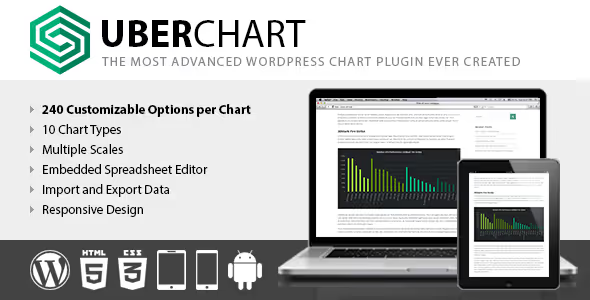
UberChart, a premium plugin from CodeCanyon (Envato), and its trump card: depth of customization. One chart has 240 parameters: fill color, font style, line thickness, animation speed, axis and scale settings. If you need the chart to look like part of your site's unique design, not like a standard "google chart," this is your tool.
Ten chart types (line, bar, pie, area, radar) cover standard needs. Data can be entered in the built-in spreadsheet editor or loaded from Excel, Open Office and Google Sheets.
Price is one-time, without annual subscriptions (UberChart page on CodeCanyon). For a one-off project more profitable than annual Visualizer Pro.
Pros:
- 240 customization parameters per chart
- 10 chart types
- Import from Excel, Open Office, Google Sheets
- One-time payment (price below), no subscription
Cons:
- Interface not the most modern
- No live sync with external sources
- Support and updates by Envato model (6 months included in price)
Price: one-time payment (CodeCanyon).
🔗 UberChart on CodeCanyon (product page)
9. DW Chart
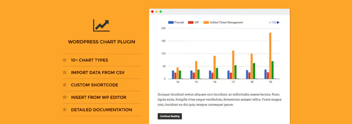
DW Chart, another premium plugin from CodeCanyon focused on Google Visualization API. Ten-plus chart types: bar, pie, geographic (maps), tree and combination. Data is entered manually through admin, import from external sources is not provided.
The plugin is fully responsive and embeds in a page with one shortcode. For small sites where you need to visualize 5-10 metrics and forget about it, quite a workable option (DW Chart page on CodeCanyon).
DW Chart has not received updates since 2019. It works on the current version of WordPress, but there are no guarantees of compatibility with future versions. If you take it, test on staging.
Pros:
- 10+ chart types, including geographic maps
- Google Visualization API, stable rendering
- Responsive design
- One-time payment (price below)
Cons:
- Not updated since 2019
- Manual data entry only
- No demo version before purchase
Price: one-time payment (CodeCanyon).
🔗 DW Chart on CodeCanyon (product page)
10. iList Pro

iList Pro, a plugin for infographics, not for charts in the classic sense. It's designed for visual formatting of lists, comparisons, and step-by-step instructions: 80+ ready-made templates and 800+ Google Fonts in one interface.
The plugin generates shortcodes, and you insert infographics anywhere in a post or page. Backend editor is simple: chose template, filled fields, published. No coding needed.
The tool suits content marketers who want to diversify articles with visual blocks without launching Canva or Figma. But if you need numerical charts with X/Y axes, take Visualizer or wpDataTables.
Pros:
- 80+ infographic templates
- 800+ Google Fonts
- Shortcode generator, insert in any part of page
- One-time payment ($25)
Cons:
- Doesn't build numerical charts (bar/line/pie)
- Templates look dated compared to Canva
- Manual content entry only
Price: $25 one-time (CodeCanyon).
11. Responsive Charts
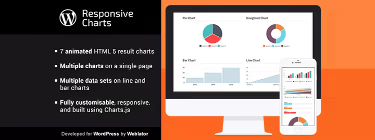
Responsive Charts, a compact premium plugin (price listed below), that does exactly what it promises: responsive animated HTML5 charts. Seven types: bar, pie, line, area, doughnut, pie and polar area. All animate on scroll.
You can place multiple charts on one page, the plugin doesn't conflict with itself. Configuring colors, sizes and labels through the interface in admin, without code.
Downside: no data import. Each value is entered by hand. For a 50-row table that's tedious. But for 5-7 metrics on a landing page, fast and cheap.
Pros:
- Animated HTML5 charts
- 7 chart types
- Multiple charts on one page
- Very cheap (price listed below)
Cons:
- No data import
- Only basic chart types
- Small community
Price: one-time payment (CodeCanyon).
🔗 Responsive Charts on CodeCanyon (product page)
12. Superb Tables

Superb Tables (formerly Data Tables Generator by Supsystic) covers the need for "table + chart in one bottle." The plugin creates tables with sorting, search and pagination, and on top of the same data builds charts: bar, pie, line.
The free version includes: unlimited rows and columns, global table search, CSS editor for appearance customization. Pro version ($46/year, Supsystic pricing) adds editable fields, change history, PDF export and print layouts.
From TablePress the plugin differs by having charts out of the box, no need to install a second tool to visualize the same data. And from wpDataTables, by lower price and simplicity.
Pros:
- Tables + charts in one plugin
- Unlimited rows and columns in free version
- Global search and sorting
- CSS editor for customization
Cons:
- Pro version for editable fields and export (price listed below)
- May lag on large tables
- Fewer chart types than Visualizer
Price: free; Pro, $46/year (Superb Tables on Supsystic).
🔗 Superb Tables on WordPress.org
⁉️🤔 Frequently asked questions
Do I need to know how to program to work with visualization plugins?
No. All plugins in this roundup work through the visual interface of the WordPress admin. You fill in data in a spreadsheet editor, choose chart type and configure colors, code generates automatically. For most scenarios (blog, landing page, corporate site) TablePress for tables and Visualizer for charts are enough, both configure without code. If you need to adjust individual colors or fonts, CSS editor is available in Superb Tables and UberChart.
Which plugin to choose for large data volumes?
If you have more than 1000 rows, look at wpDataTables. It connects directly to MySQL and processes tens of thousands of records with pagination and filtering without speed degradation. TablePress handles such volumes worse: at 5000+ rows the backend starts to lag. For very large data (100K+ rows) wpDataTables Pro supports server-side processing, database queries execute asynchronously.
How does Visualizer differ from wpDataTables?
Visualizer is primarily about charts (15 types, including geo maps and timelines). wpDataTables is about tables with advanced data management, where charts are an additional module. If your data already sits in MySQL, take wpDataTables. If you just need to build a beautiful chart from CSV, Visualizer. Price-wise Visualizer Pro is more expensive, but wpDataTables requires a higher entry threshold (exact figures see in plugin cards above).
Can I use multiple visualization plugins simultaneously?
Yes. Plugins don't conflict: you can build tables through TablePress, charts through Visualizer, and infographics through iList Pro on the same site. The only risk: duplication of JS libraries (two versions of chart.js), but in practice this rarely causes problems if plugins load scripts through wp_enqueue. Tip: when using 2+ plugins enable caching and lazy load for scripts through WP Rocket or Autoptimize.
Plugin hasn't been updated for several years, can I install it?
With caution. From this roundup DW Chart hasn't been updated since 2019, but works on the current WordPress version. If you choose such a plugin, test on staging with WP_DEBUG enabled. Lack of updates doesn't always mean "broken," sometimes functionality is just complete. For a commercial site we recommend plugins with active support: Visualizer, wpDataTables, TablePress.
Do free plugins seriously lag behind paid ones?
Not always. TablePress (free) gives almost all functionality of wpDataTables Pro for basic tables. M Chart (free) renders charts through Highcharts, the same library used by banking dashboards. The difference shows up in specific scenarios: live connection to database, PDF export, conditional formatting. For starters take the bundle TablePress + Visualizer Free + M Chart, this will cover the vast majority of needs.
What to install on your site: final breakdown
Twelve proven plugins for data visualization on WordPress, from simple tables to BI dashboards with live database connection. There's no universal "best": the choice depends on what exactly you're visualizing and for whom.
If you need simple tables without charts, install TablePress. Free, reliable and no learning required.
If you need diagrams and charts, Visualizer (especially Pro with 15 types and Google Sheets sync). The sweet spot in price/features ratio.
If you work with large datasets or connect MySQL, wpDataTables. You'll need to spend an evening on setup, but then tables and charts update themselves.
If budget is limited, assemble a bundle of TablePress + M Chart + Ninja Charts. All free, and for a blog with 5-10 charts more than enough.
And the main rule: one page, one key chart. Don't turn a post into a spaceship dashboard. The user came for meaning, not for axis animation.

A professional team of writers and editors specializing in creating quality content.